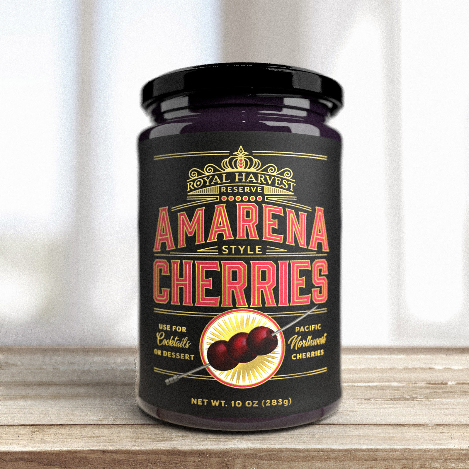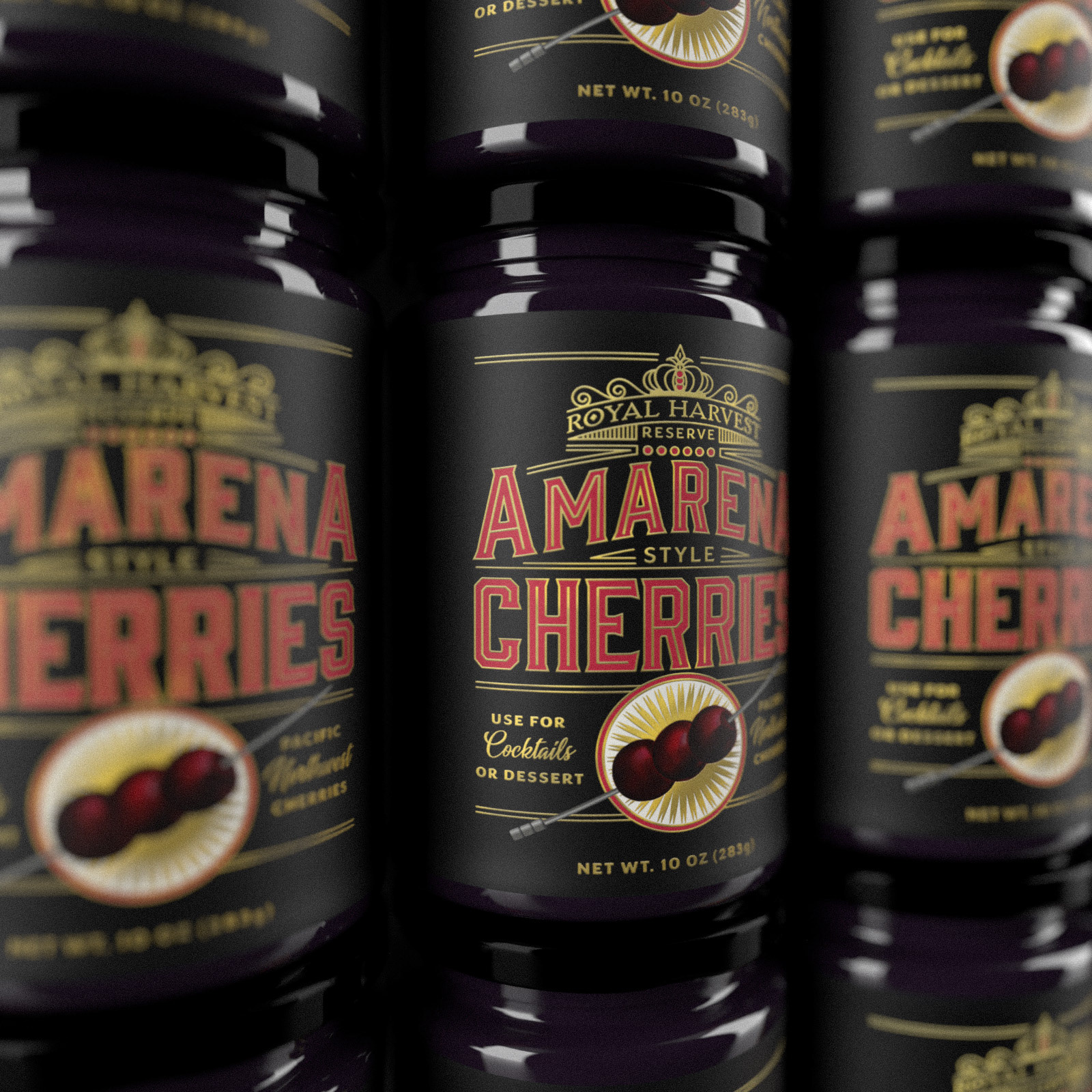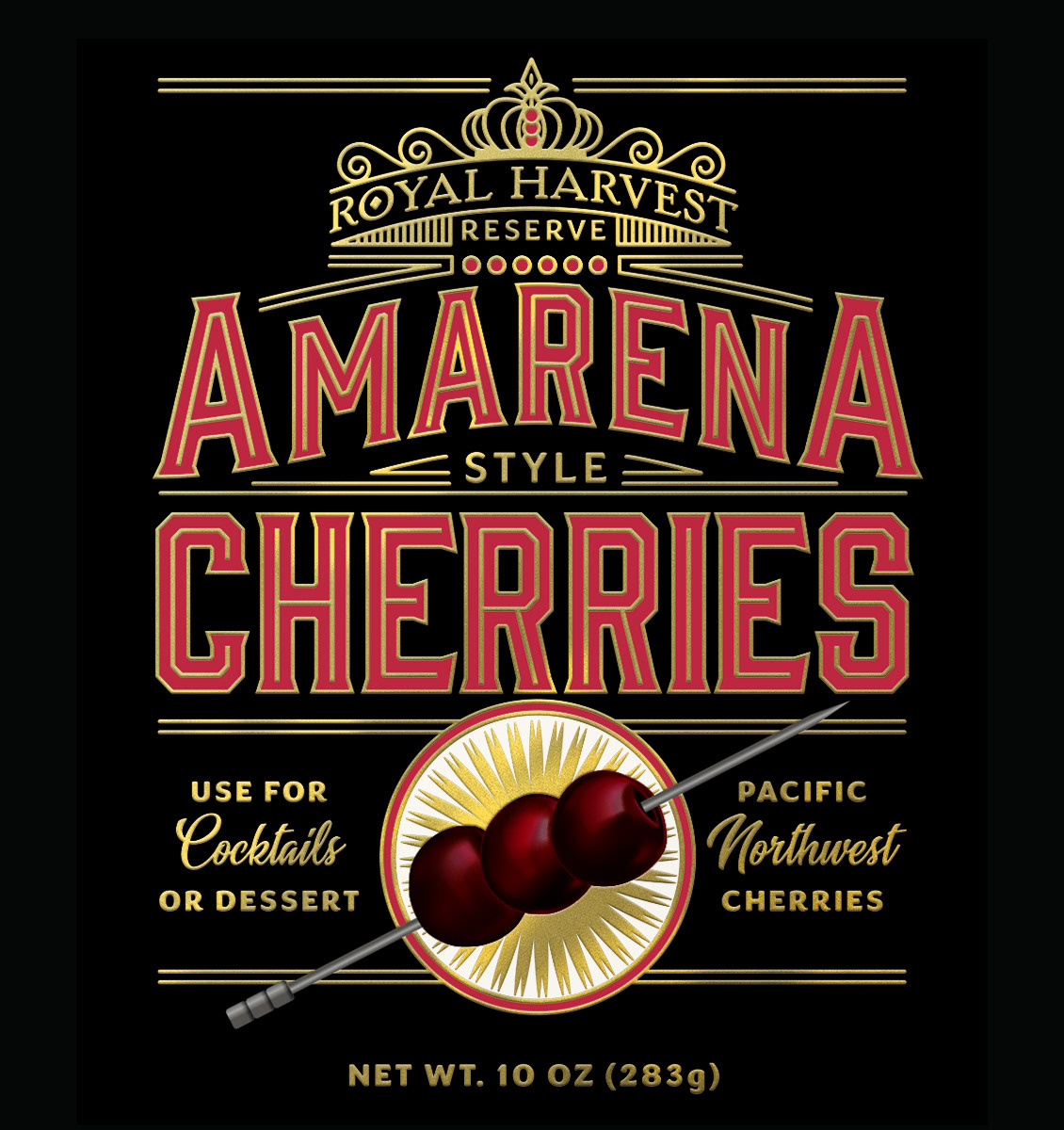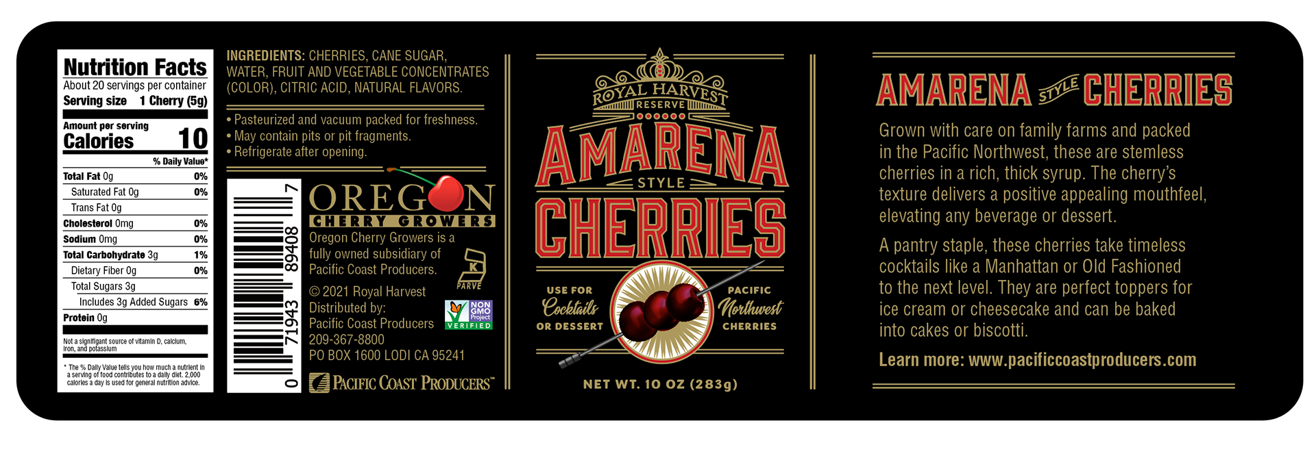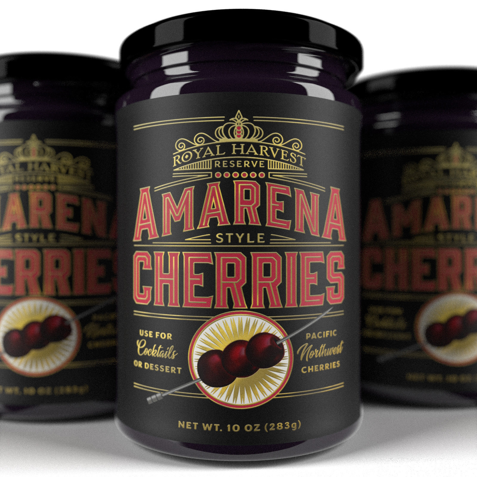
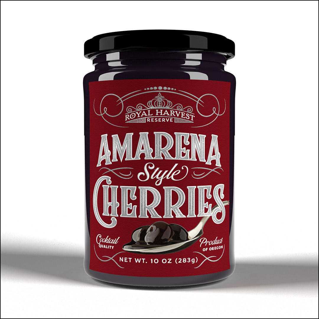
Royal Harvest Reserve Amerena Style Cherries
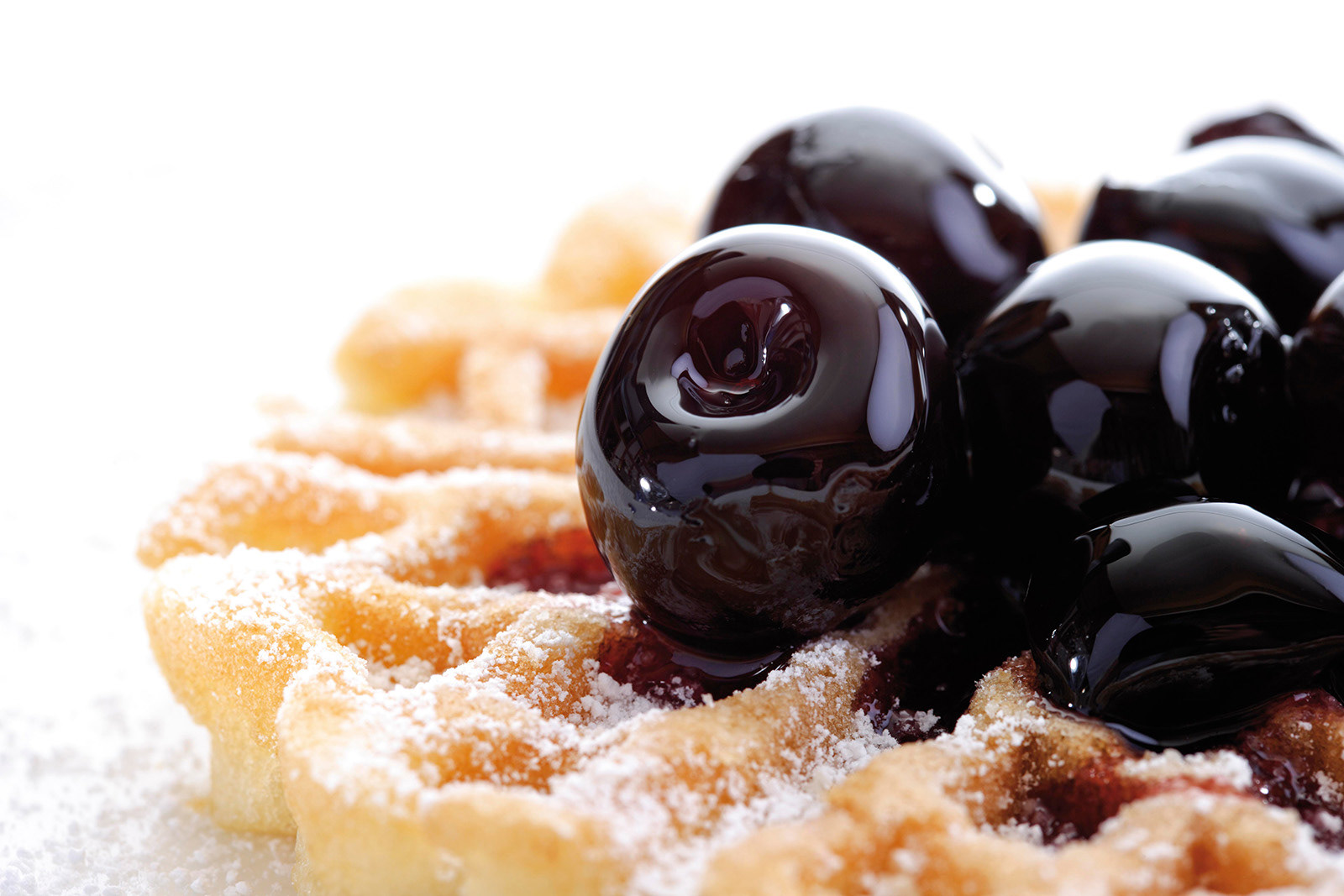
Amarena Cherries are a rich, black, Italian cherry traditionally used for desserts and are currently very popular in the craft cocktail market. My client, Pacific Coast Producers, owns a lot of cherry-producing farms in the Pacific Northwest and they have been growing this varietal of cherries in some of those locations. They wanted to create packaging that would appeal to high quality dessert use as well as the craft cocktail market and that could sit comfortably on the shelves of high-end retail food stores (Williams Sonoma, Dean & DeLuca type environments). I did several rounds of designs, but because of the craft cocktail relationship, it was ultimately determined that the visual direction should lean towards spirits labeling. The final product is foil-stamped and has both matte and gloss varnishes to up the luxury goods quotient.
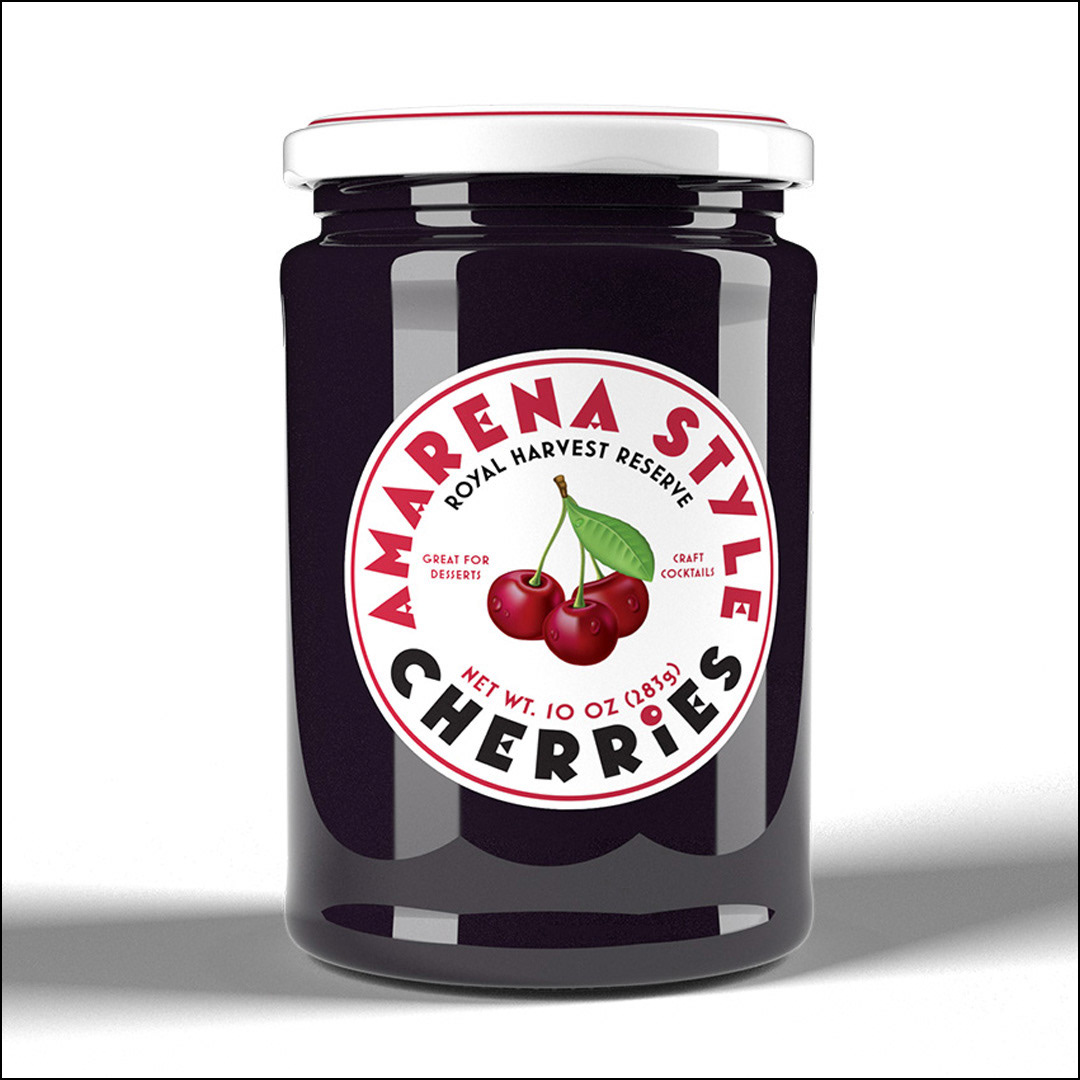
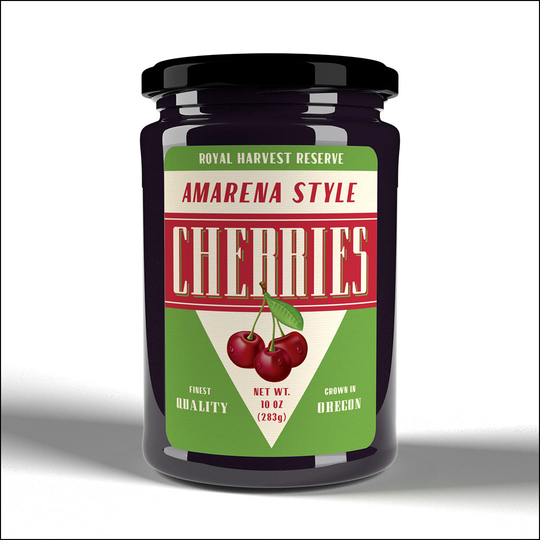
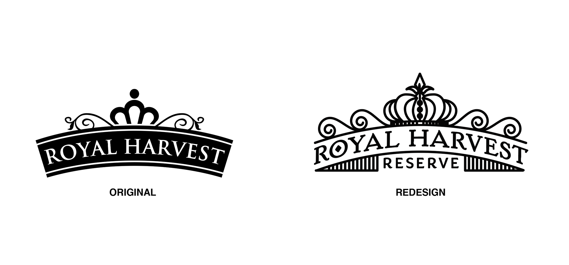
Royal Harvest is an existing brand of cherries, but in this case, because we were entering a higher-end market with a new product I was asked to redesign/refresh the brand logo as well to the new reflect the "Reserve" status of this product line so you can see a variety of treatments I created on the unused work, as well as a side-by-side with the existing brand logo/new logo below.
As a side note, this is an absolutely delicious product. If you see a jar, grab them and try them on ice cream or in your favorite cocktail.
Development
These are some of the unchosen alternative designs. Initially, I looked to Italian label design for inspiration and produced the 2 designs below, but the client felt that these did not reflect the luxury goods nature of the product, nor one of its primary target audiences which is the burgeoning craft cocktail market.
Additional Exploration
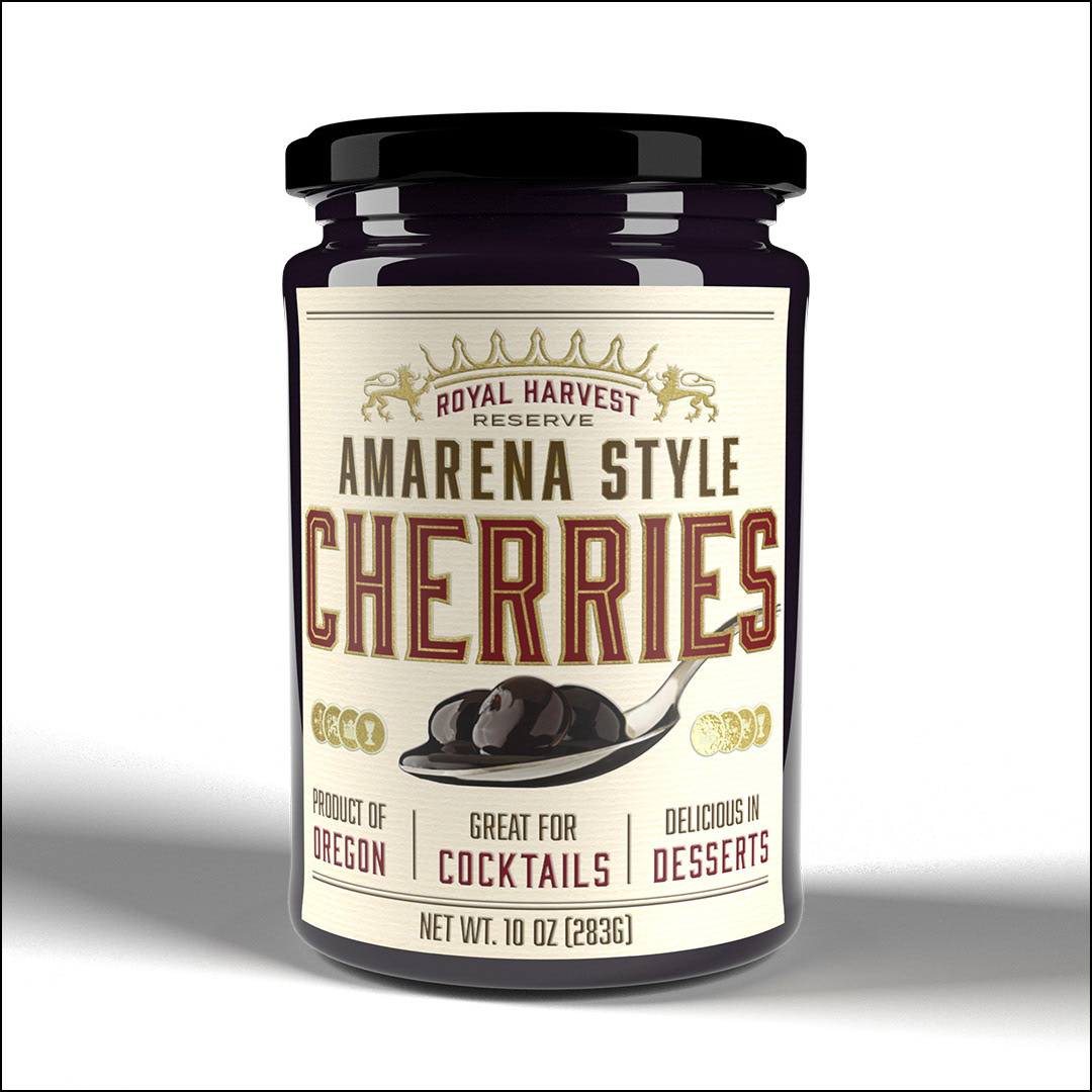
With that direction in mind, I set out to create several more designs that were directionally closer to a spirits label. I produced these two along with the final chosen design. All drew inspiration from the spirits industry:
Brand Refresh
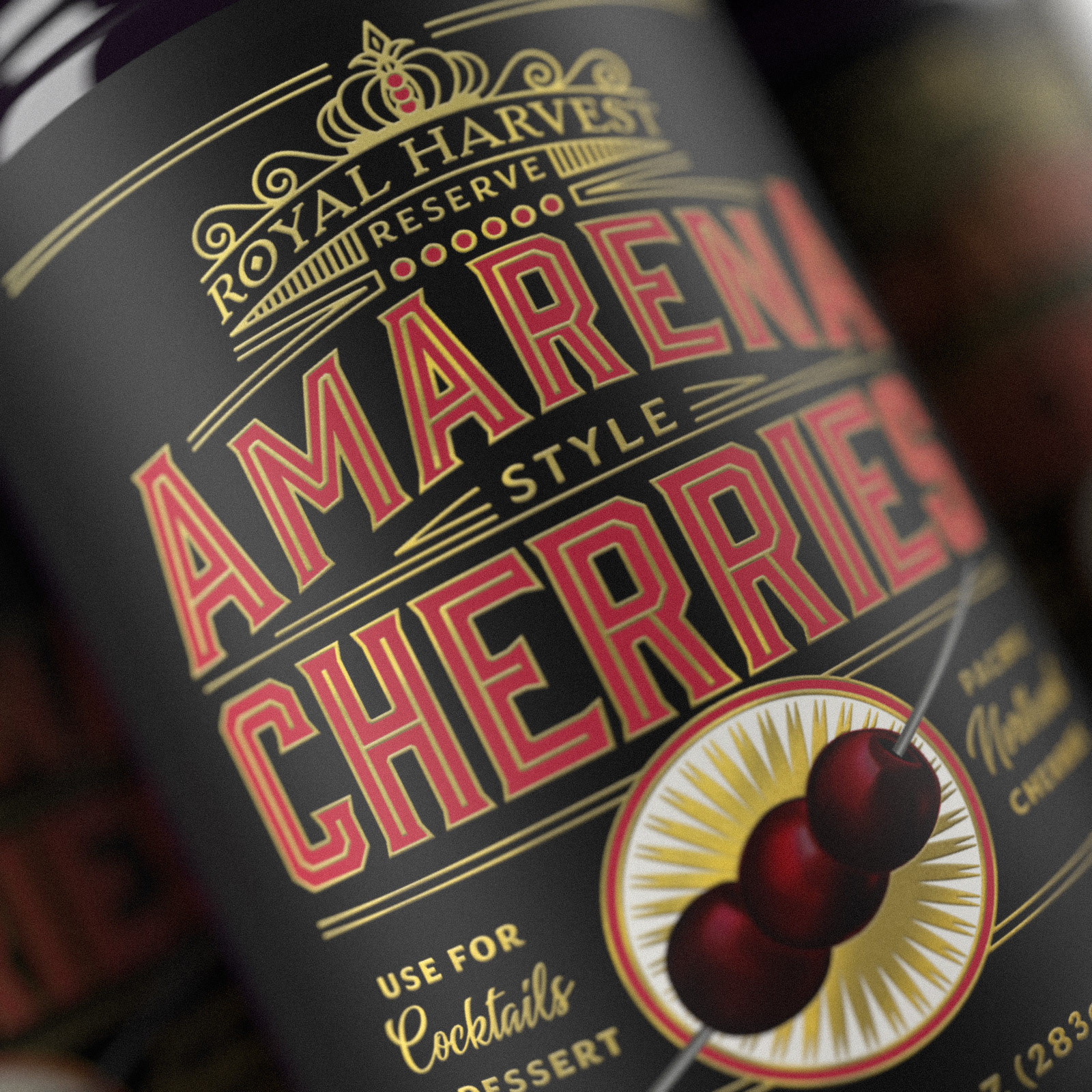
In order to distinguish the "Reserve" line and mark it as a higher-end product, I was asked to refresh the brand while keeping it recognizable enough that we would not lose any existing brand equity or goodwill. A new typeface, a vintage feel, more linework, and more consistently weighted linework helped elevate the brand.
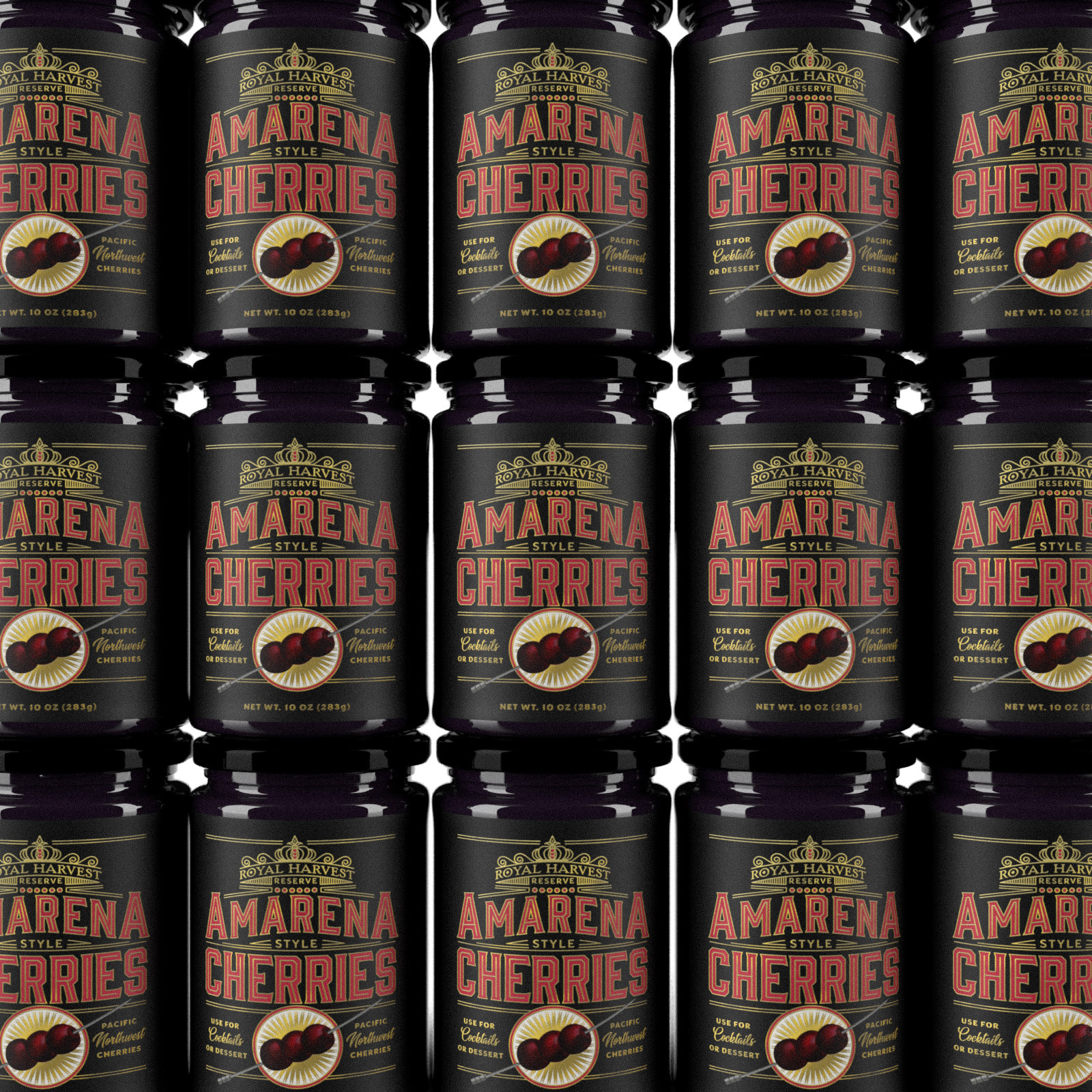
Final Product
Ultimately the design below was chosen because it reflected the client's direction to create a product that would appeal to the craft cocktail market and it is an elegant solution that can sit comfortably on the shelf in high-end retail food shopping environments.