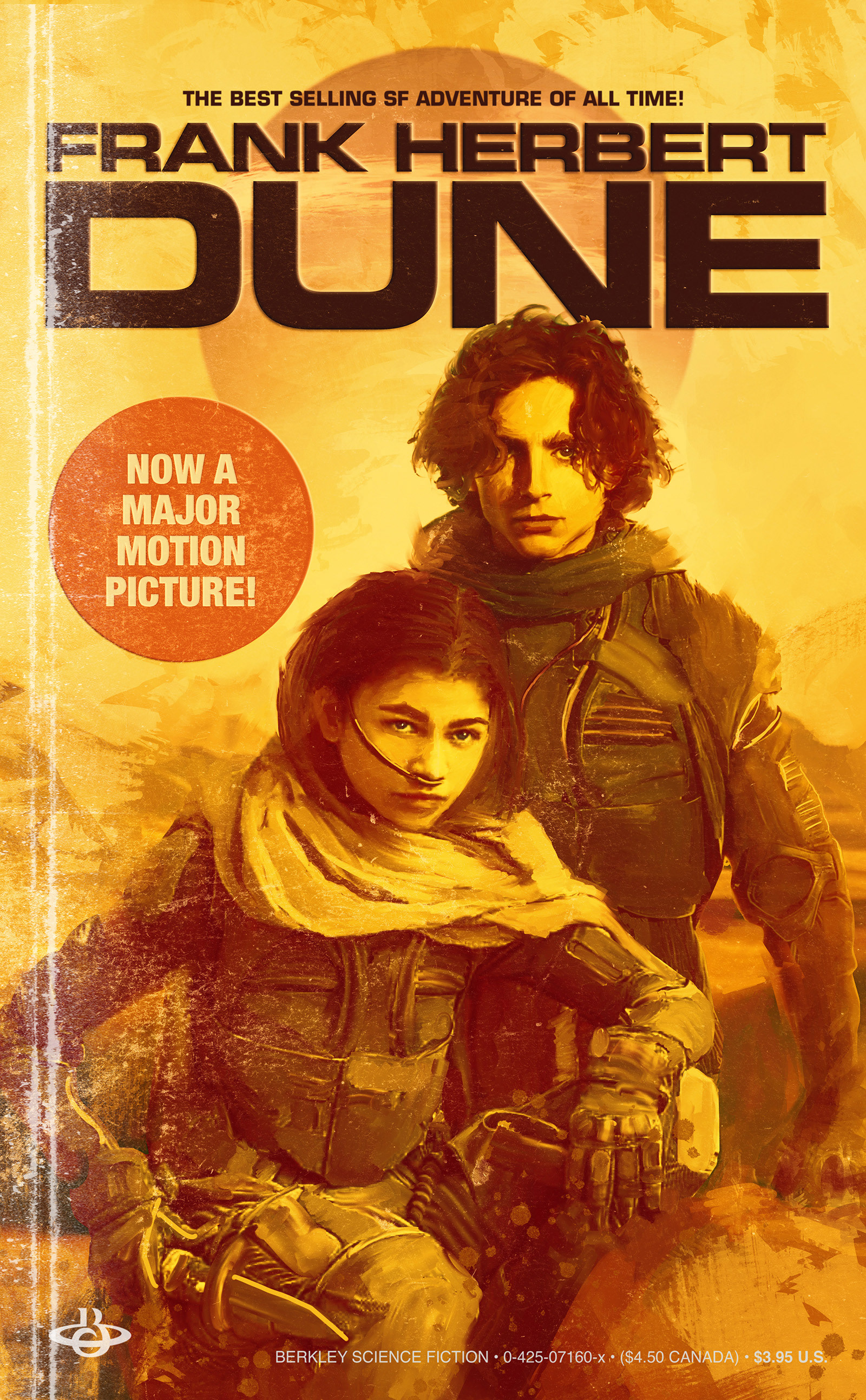
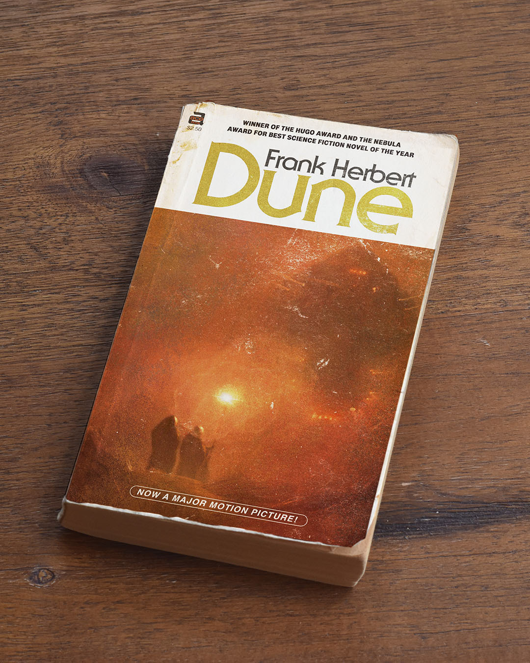
Fake Dune Book #1: 1980s Mass Market Style
I first read Dune in at some point in the late ’80s and I thought it would be fun to reimagine the 80’s mass-market book jacket as if it was released with a tie-in to the recent film, complete with dog eared distressing to show how well-read my copy was.
I’m a Dune Fanboy. I loved the books—or at least most of them. I loved David Lynch’s much-maligned 1984 adaptation and I even liked the Sci-Fi network's version, so when I heard that Denis Villeneuve was remaking it I was stoked. He is a director with the epic vision for something as big as this project and if the trailers are an indication he hit it out of the park.
Got some Eurostile Bold Extended for the title treatment which would have been a totally acceptable solution for a Sci-Fi book in the 80s, along with some excellent Helvetica compressed, regular and bold for some of the little details which all would have been about right for the time. The actual Dune mass-market book jackets from that period had a much more expressive typeface on them but I always thought it was a bit too decorative for the austere aesthetic of the books. I redrew the Berkley sci-fi logo too just for the sake of authenticity.
Got some Eurostile Bold Extended for the title treatment which would have been a totally acceptable solution for a Sci-Fi book in the 80s, along with some excellent Helvetica compressed, regular and bold for some of the little details which all would have been about right for the time. The actual Dune mass-market book jackets from that period had a much more expressive typeface on them but I always thought it was a bit too decorative for the austere aesthetic of the books. I redrew the Berkley sci-fi logo too just for the sake of authenticity.
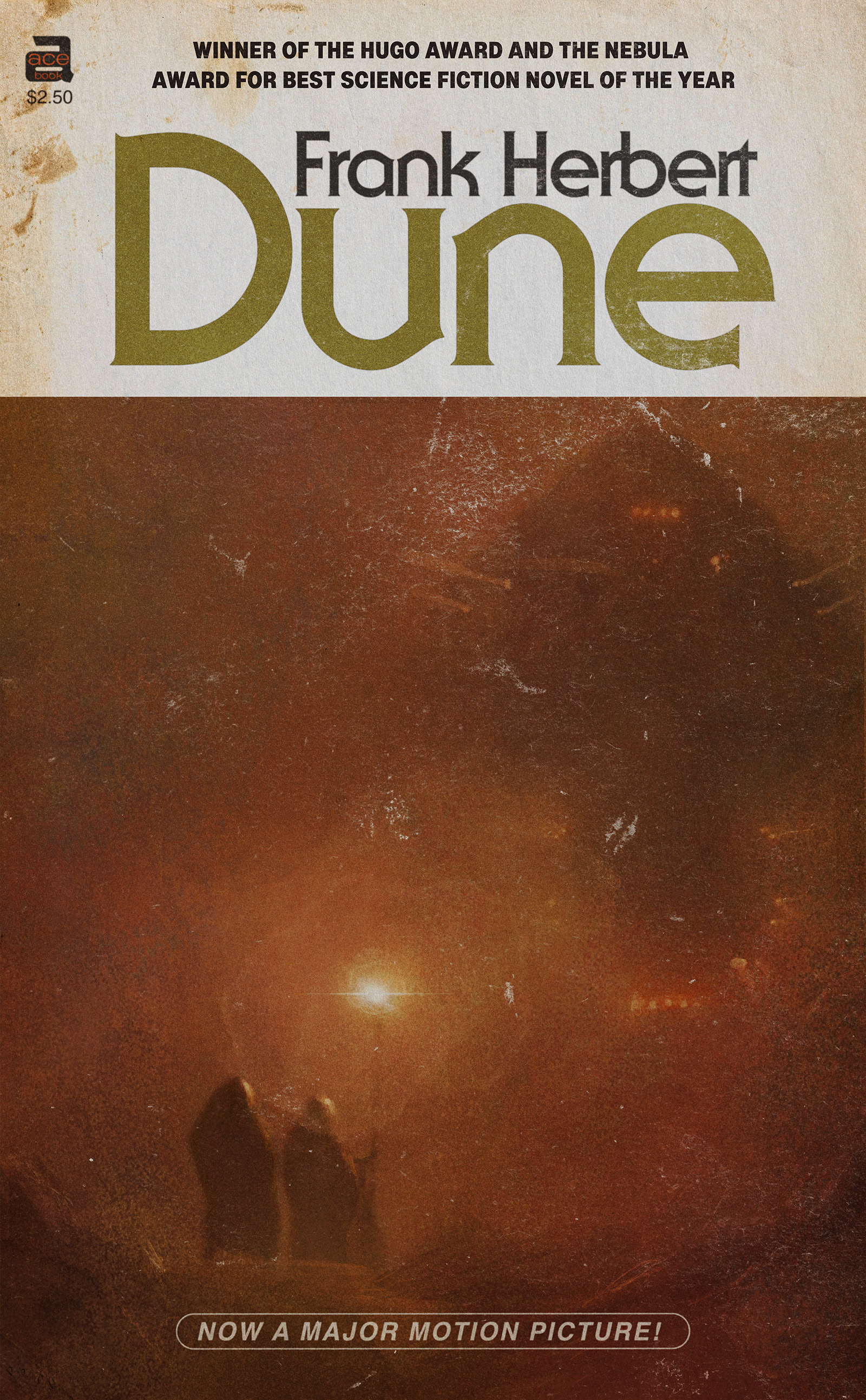
Fake Dune Book #1: 1970s Mass Market Style
Next up is a design I made based on popular layout and typography styles of the 1970s. The illustration is from reference from stills from the new Dune Movie, but it’s much simpler than the first one and more like book jacket illustration styles of the 1970s. The typeface is interesting. It’s ITC Serif Gothic designed by Herb Lubalin and Tony DeSpigna in 1972. It was used for all the Star Trek movies from the late 70s and 80s as well as advertising for the first Star Wars film in the late 70’s so it has serious Sci-Fi credibility. It is enjoying a resurgence in popularity in places like the current Star Wars marketing and the recent Lovecraft County title treatment. I did the Ace Books logo for this one. As far as I can tell they were the parent company of Berkley and published several versions of Dune under that name.

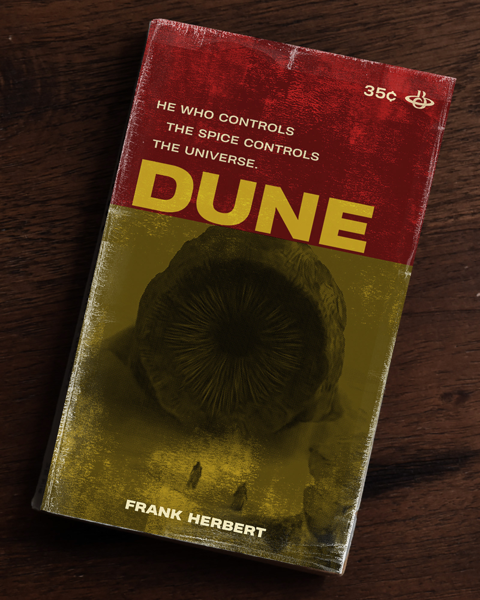
Fake Dune Book #3: 1960s First Printing
Here is the last (at least for now) of my fake Dune book covers with art from the upcoming Dune Movie. Dune’s first printing was 1965 so this is a late 60’s style. With the two above it makes a three decade set ‘60s, ‘70s, and ‘80s.
The fonts here are from the Heading Pro family by Zeta Fonts which are current and not authentic to the period but they sure look legit for the time frame to my eye. The wonky alignment and staggered subhead with weird breaks were pretty typical of pulp jackets from the period too and the color block design style was a common treatment as well.
I had a lot of fun doing a deep dive into vintage book jacket styles with this project. Makes me nostalgic for the smell of used bookstores and the wonder (and frustration at the complexity) that I felt when I first read Dune.