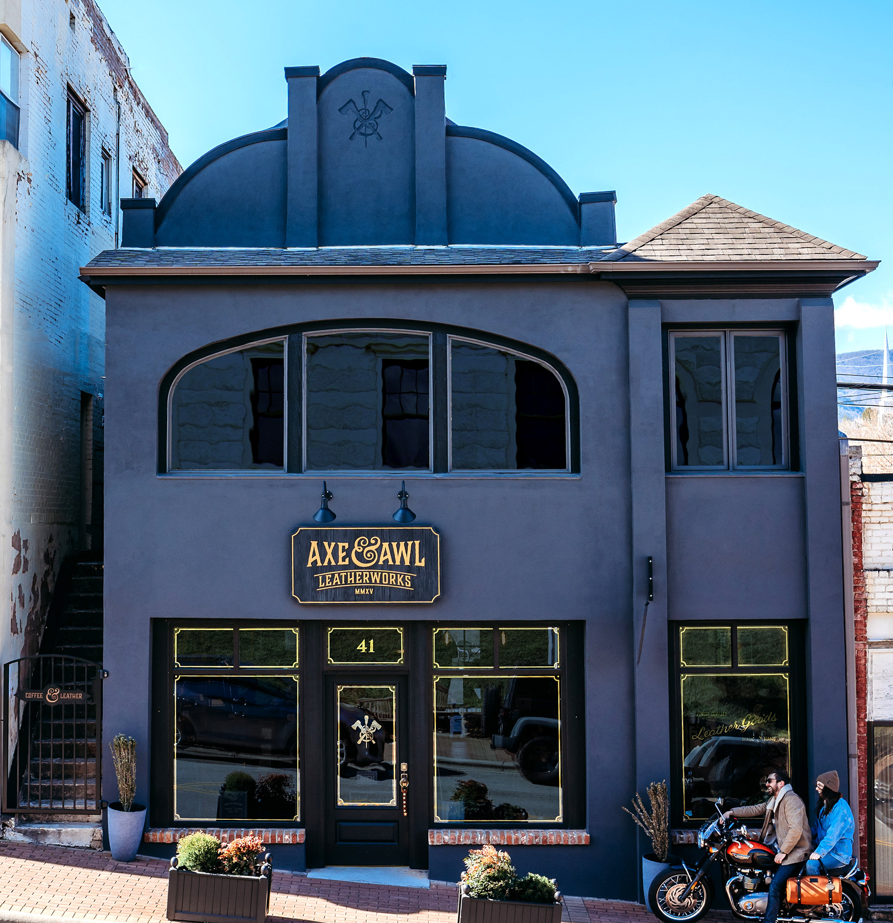
Axe & Awl Leatherworks Exterior Design
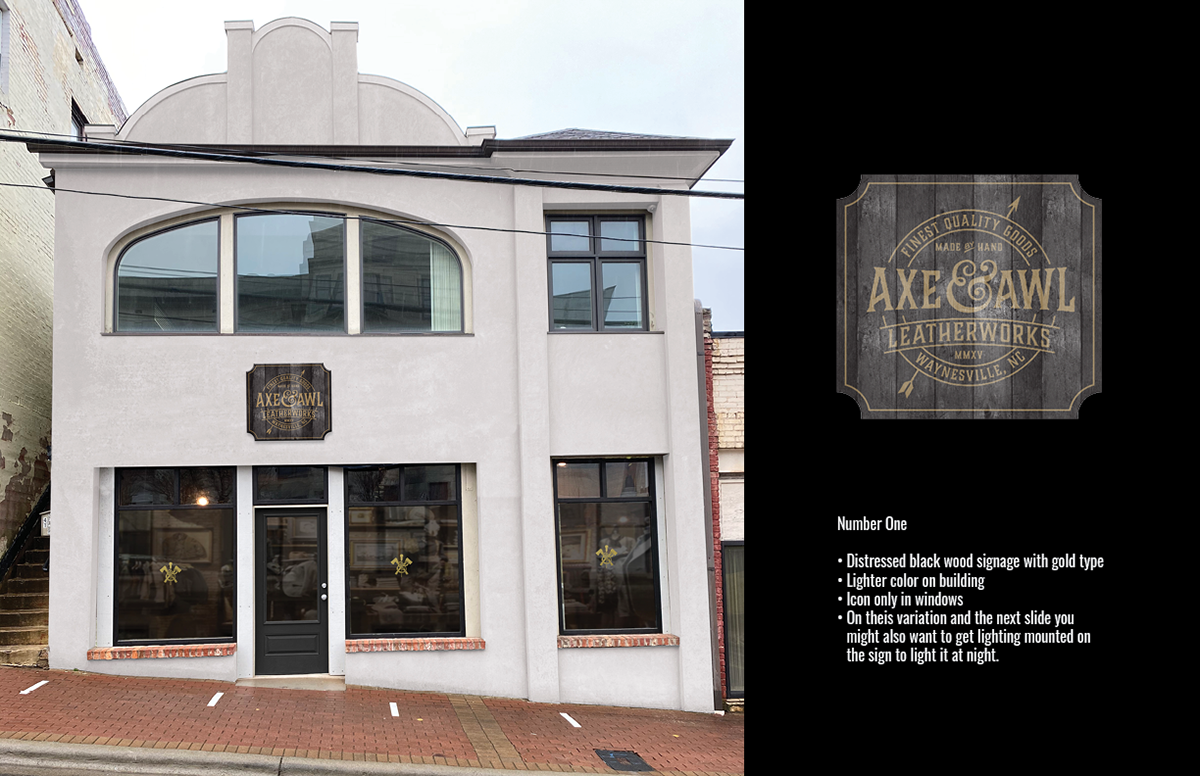
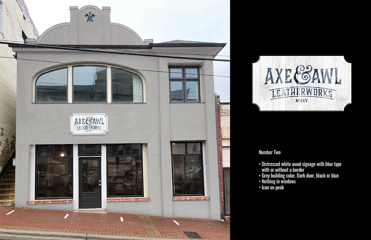
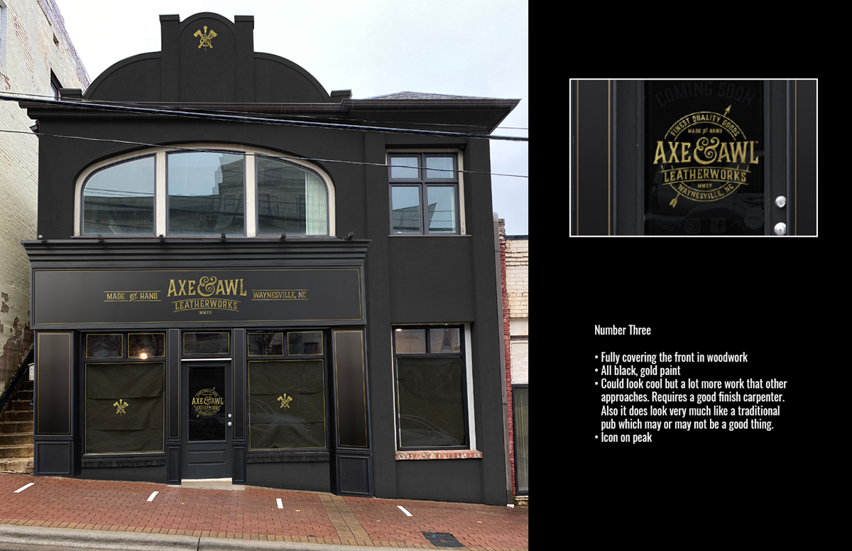
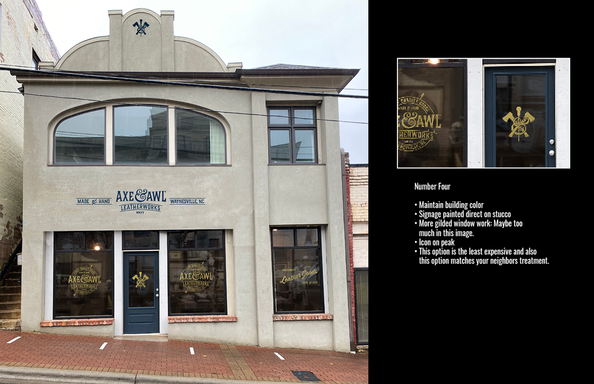
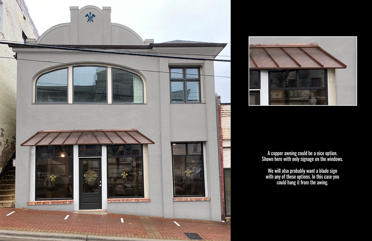
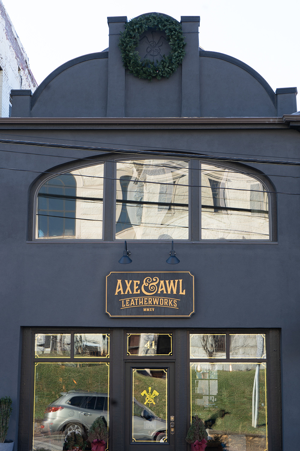
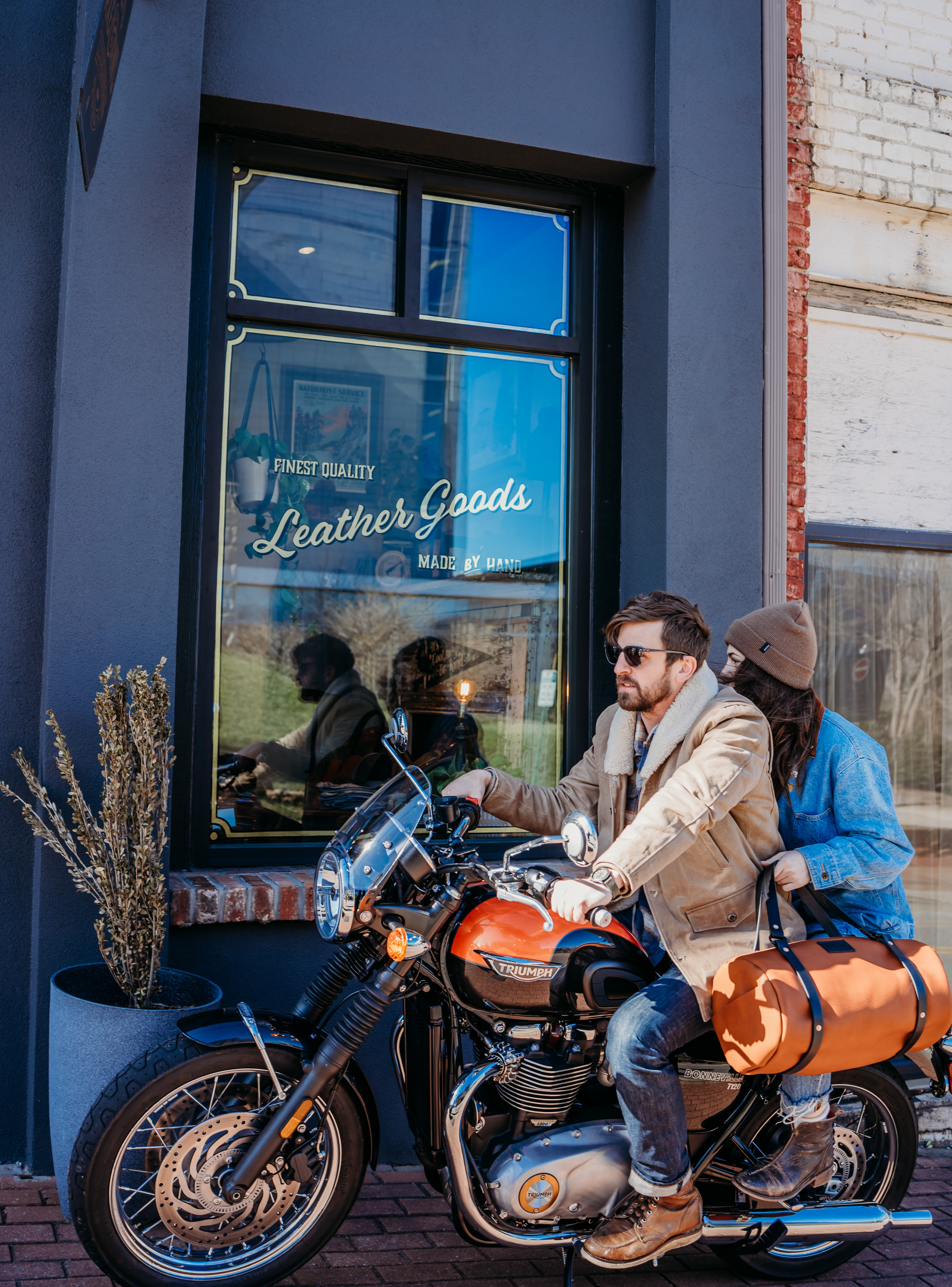
When Axe & Awl Leatherworks purchased the building above they approached me about designing the exterior. This included developing marquee signage, projection signage, gilded window signage, body and trim paint colors, and a Trompe-l'œil version of their logo for the roof peak. The above image is the final product and below are the options I presented which included a variety of approaches that fit comfortably into the brand aesthetic I developed for them.
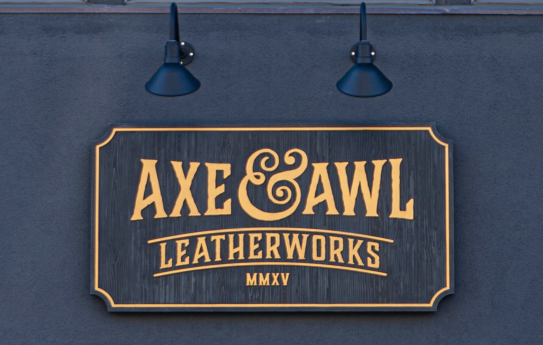
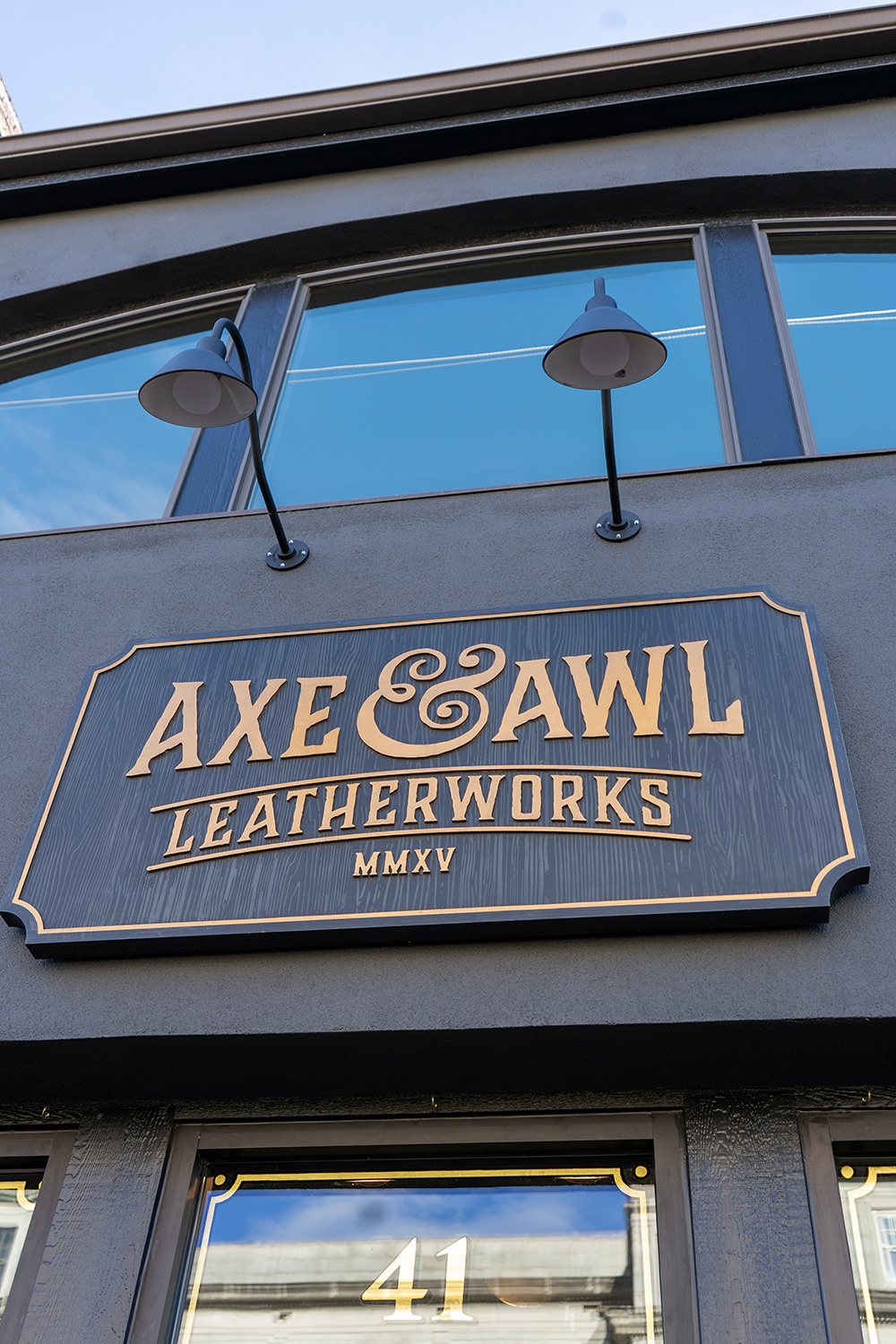
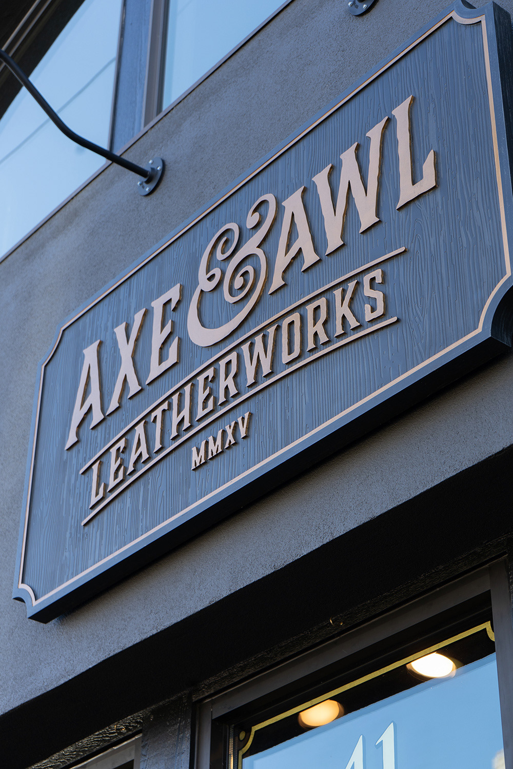
The main marquee sign shown below was carved out of wood with a CNC machine and then hand painted to have a slightly weathered feel. We were able to source "gooseneck" style outdoor lighting that fit the tone and aesthetic as well.
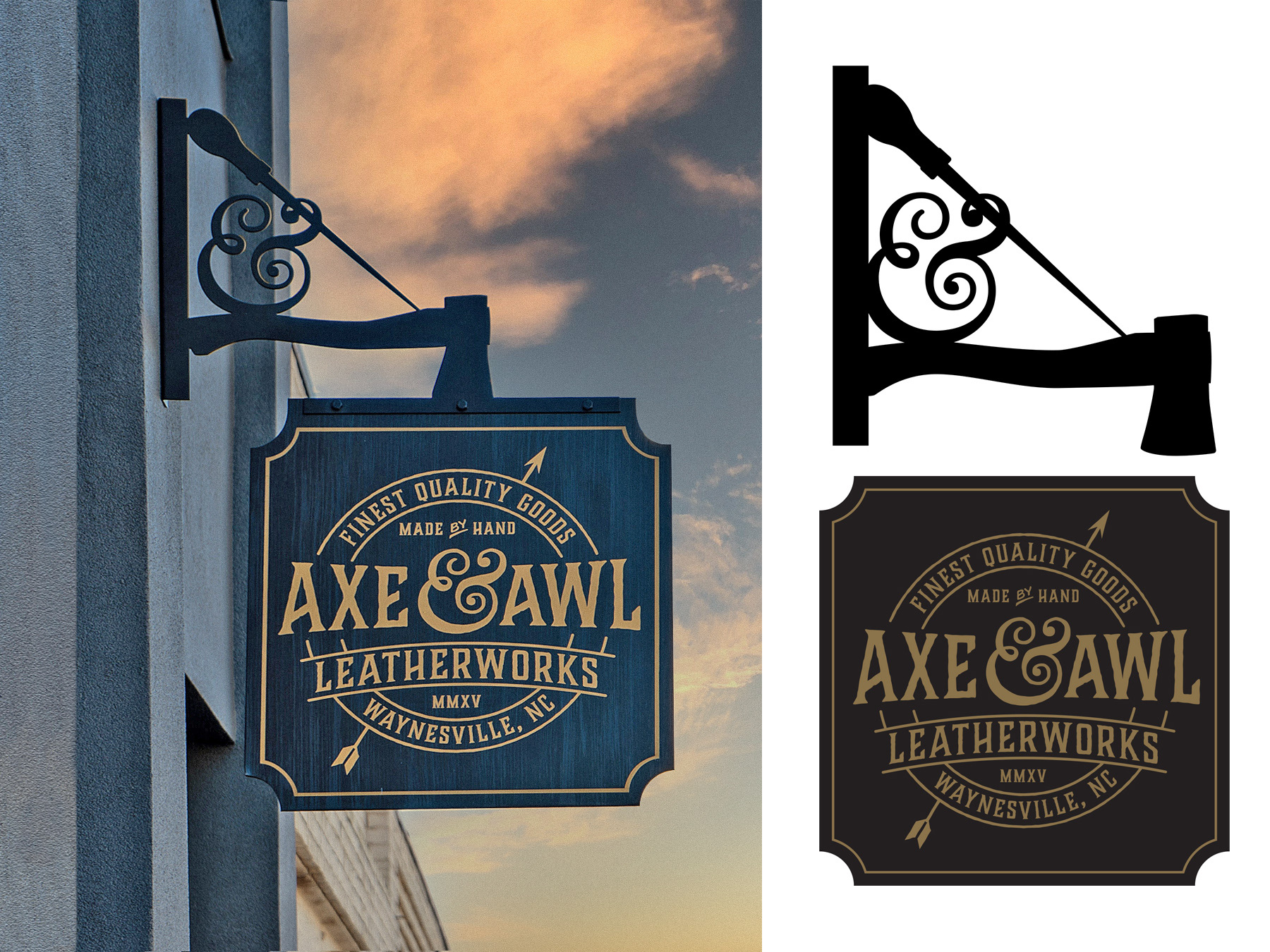
Below is the projection sign. I had an opportunity to work some of the branding elements into the locally fabricated steel bracket. Reworking the axe, awl, and ampersand elements into a fun, functional, and supportive bracket design was a really interesting challenge. The sign itself was hand painted by the same local artisan who did the others and features one of the brand extension logos I developed for this client. The arrow in this logo is a reference to a leather tannery that had been a large regional business in their town (Waynesville, NC) in the early part of the 20th century.
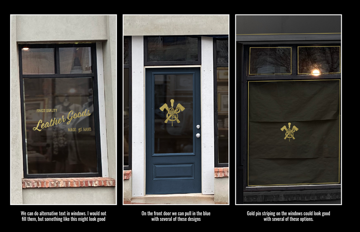
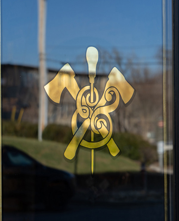
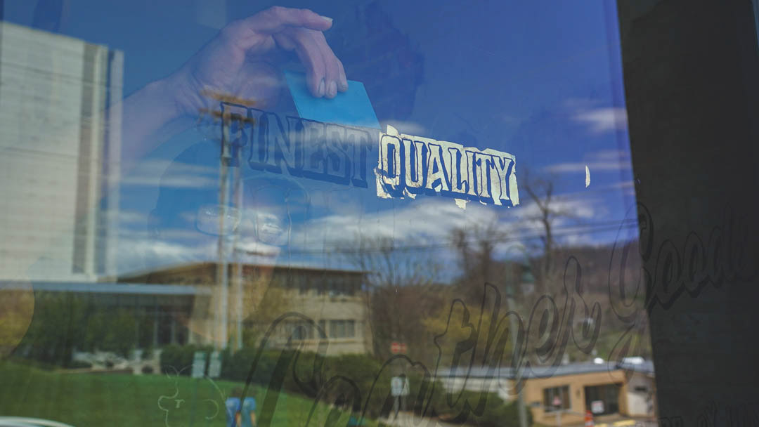
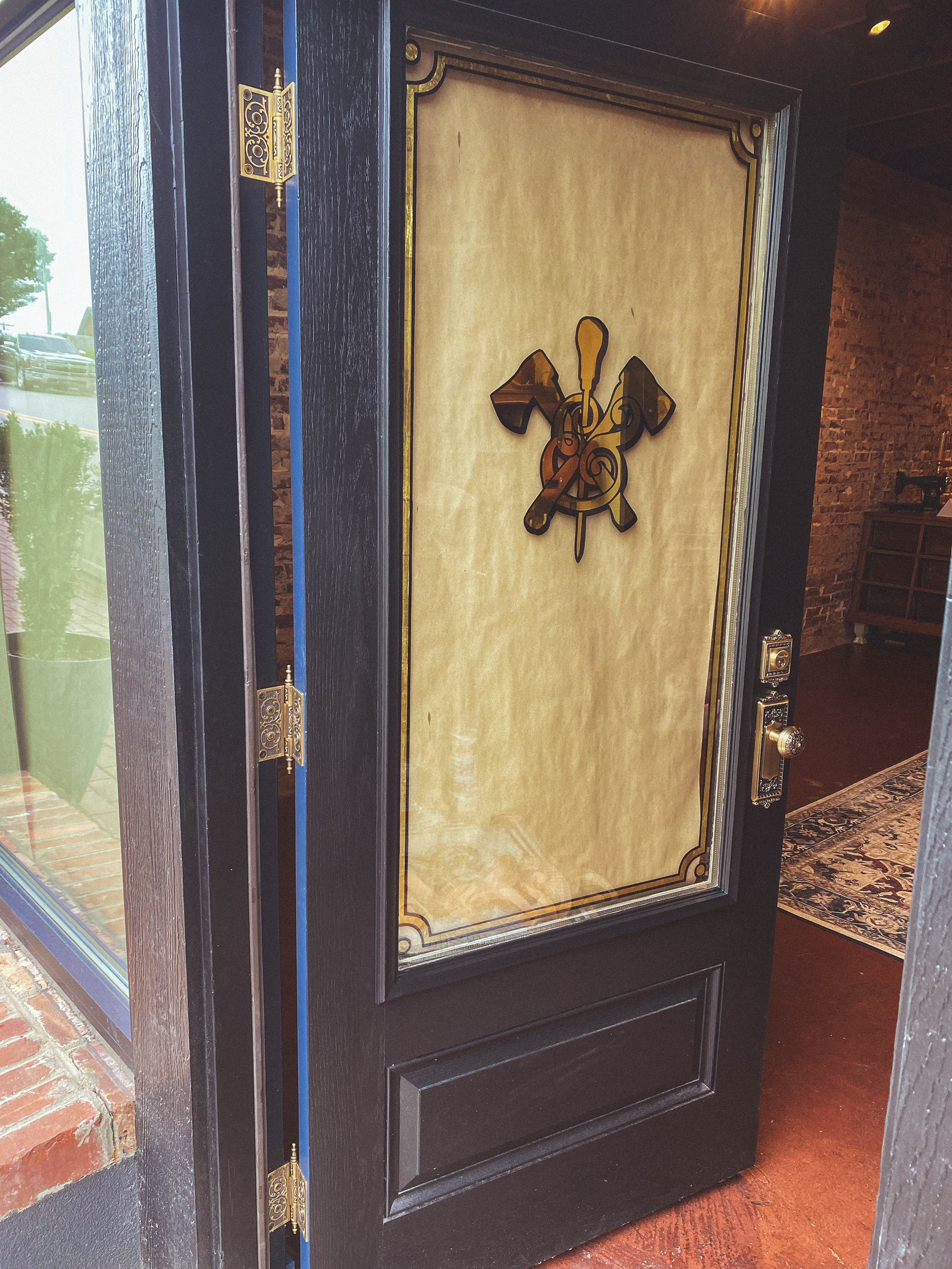
Custom gilding was added to the windows and doors including a decorative edge. We also were able to source beautiful custom hardware for the front door. Check out the hinges in the door shot below.
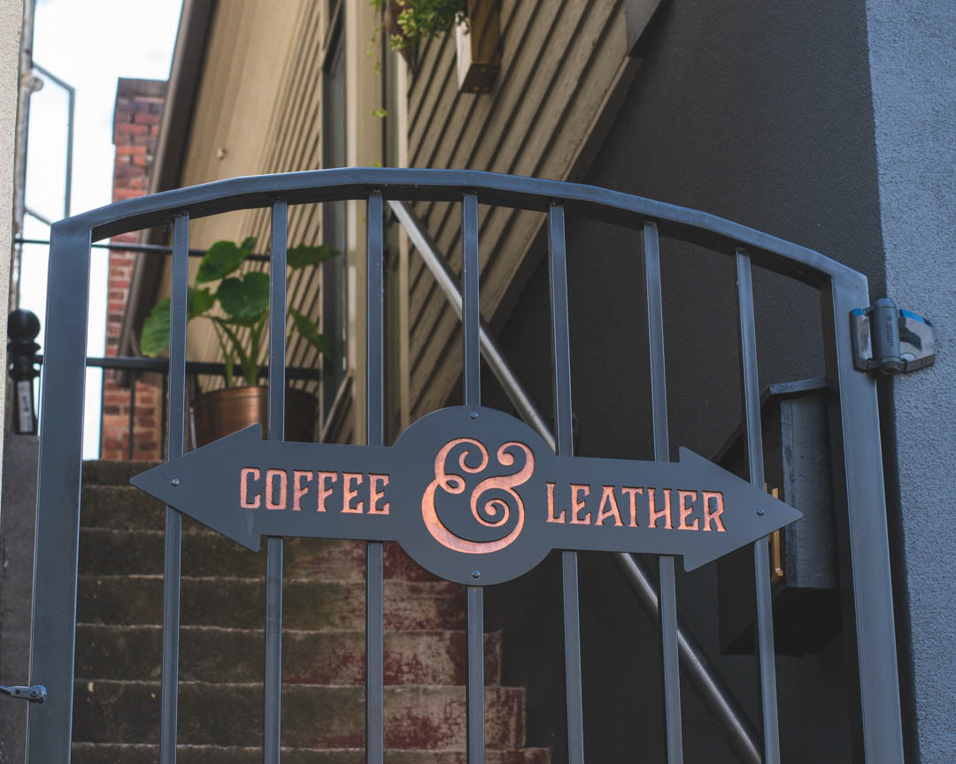
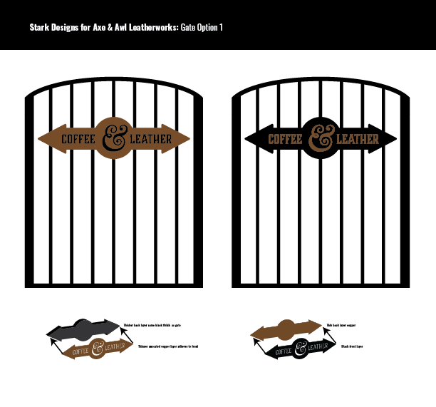
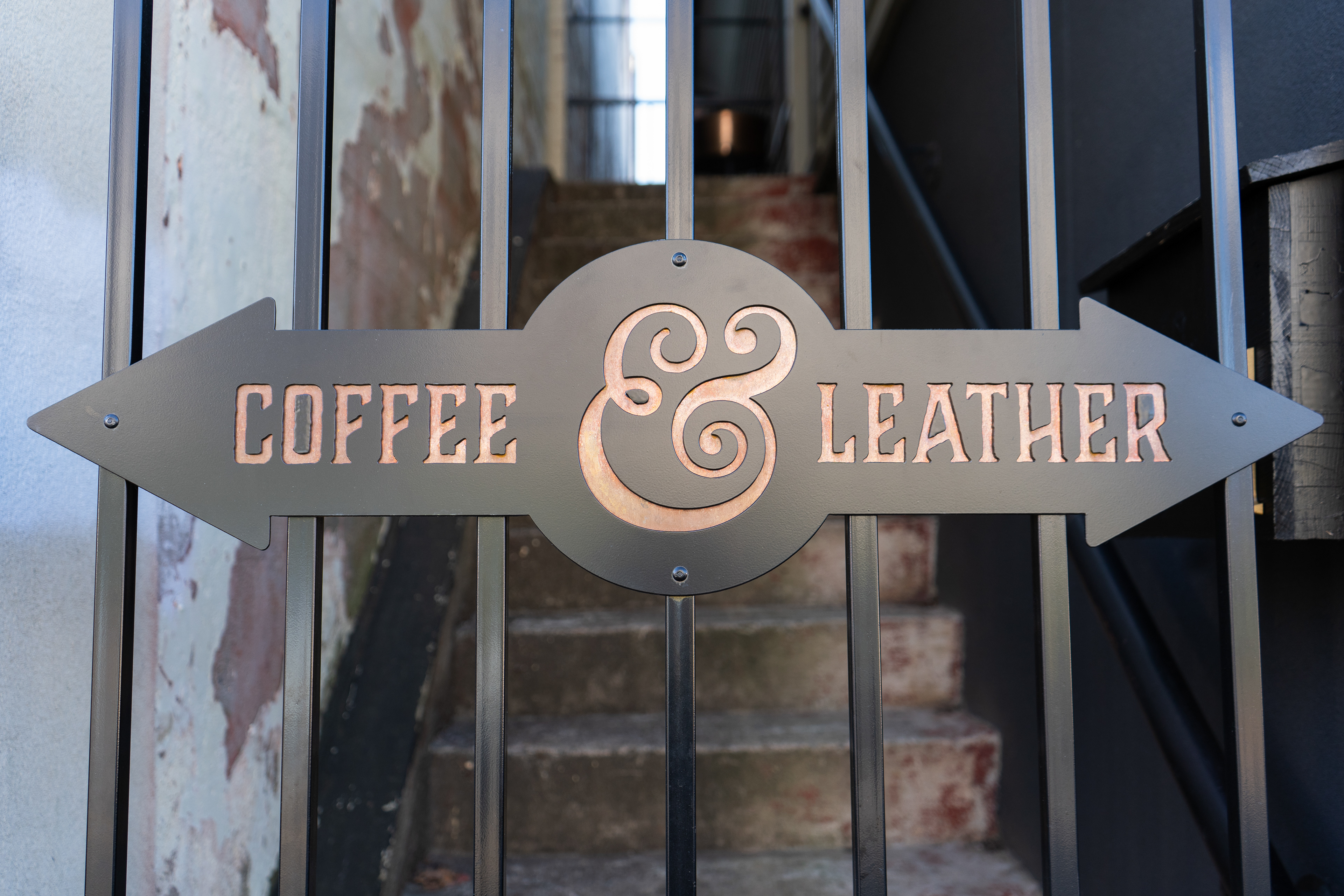
The sign below was designed for the gate on an alley between my client's leather store and their neighbor, a gourmet coffee shop. Since my client paid for it we utilized the ampersand and typography from their branding. Rather than painting the letters, I conceived of cutting them out of metal and sandwiching a layer of copper in the middle. My thought was that this will age really nicely. Uncoated copper turns a beautiful green shade known as verdigris (think Statue of Liberty).
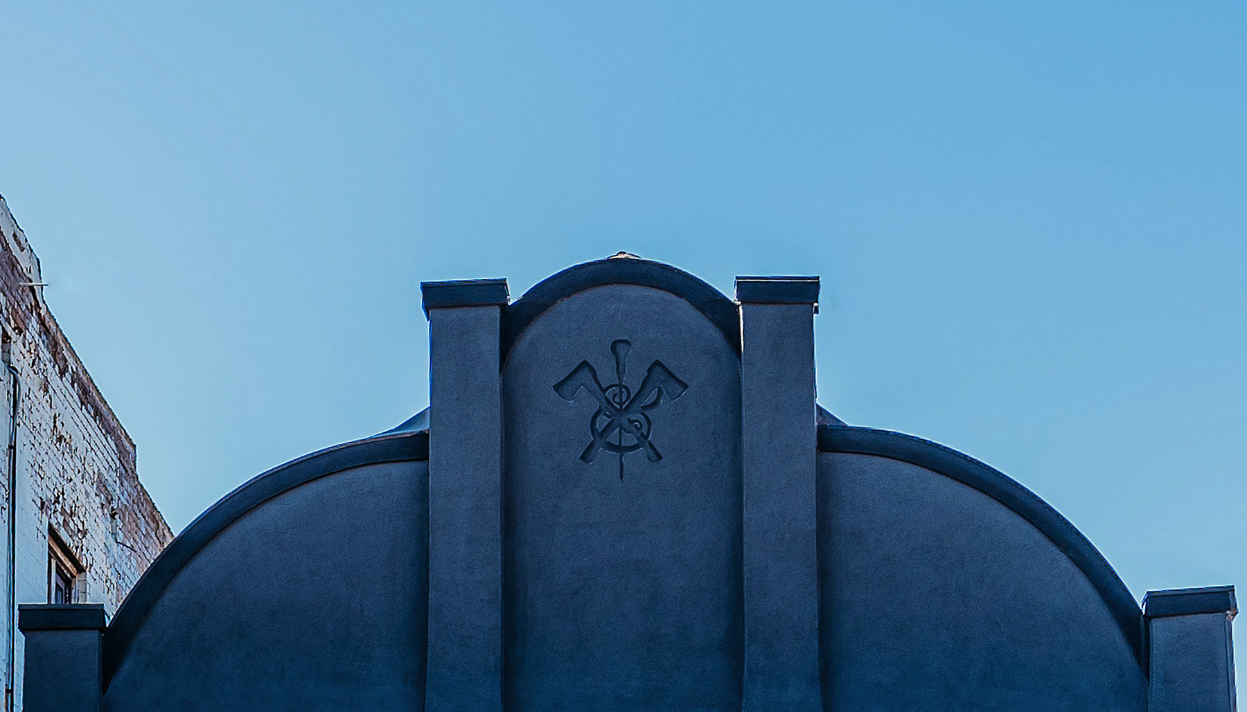
We had this awesome space at the peak of the roof. I conceived of painting a Trompe-l'œil logo (a painting technique that makes things appear dimensional). The goal was to have it appear as if it was carved in granite. Local sign and mural artist @Brushcan did an amazing job of bringing all this work to life. He is shown in the video below painting this piece of the project.
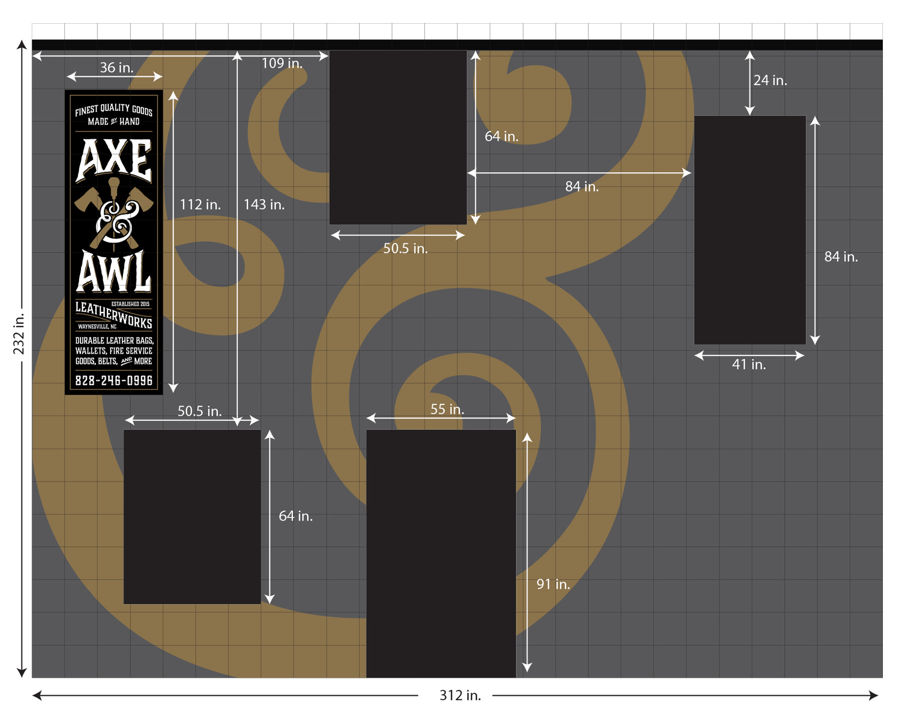
These clients are great lovers of all things vintage and when they purchased a building for a retail environment they ask me about the possibility of creating a painted sign on the back of the building facing the parking lot that looked like it had been on the brick since the early part of the 20th century. You see this type of advertising all over America and they are generally referred to as ghost signs. I designed this and we contracted with the same artist shown above to paint this piece as well
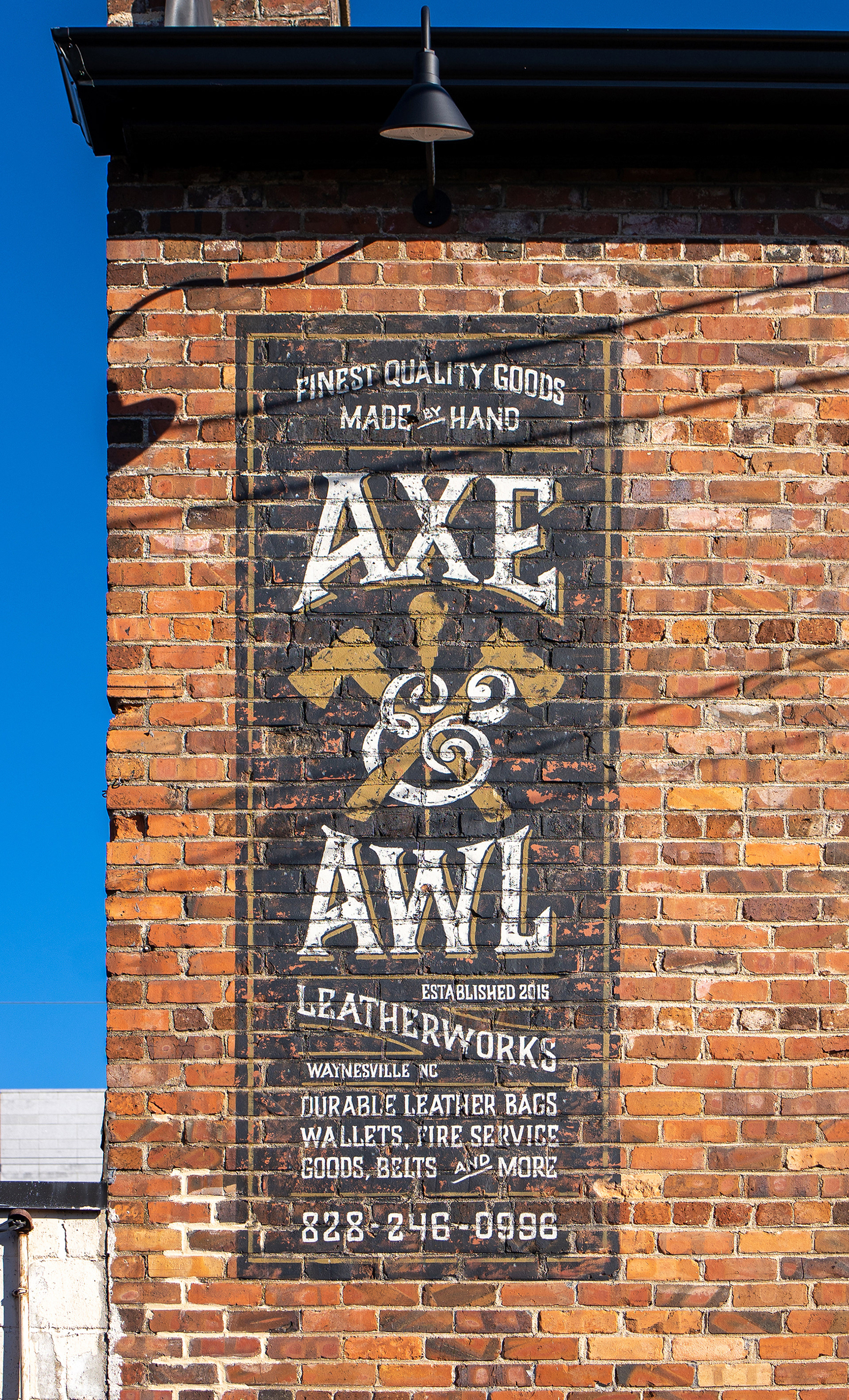
Initially it was conceived of as the entire back wall of the building as shown below, but local ordinances prohibited this amount of paint coverage for what could be considered advertising purposes.
This project was a creative journey for me. Thank you for taking the time to look! Many of the photos above were taken by the excellent @mainstreetphotography.
