
Netflix: Drop 01 Logo
Netflix: Bitconned Title Treatment
Netflix: Bodkin Title Treatment
Netflix: Bodkin Key Art Illustration Presentation
Disney Hyperion Books: Midnight Showing Cover Concepts
Netflix Holiday Moments Illustration
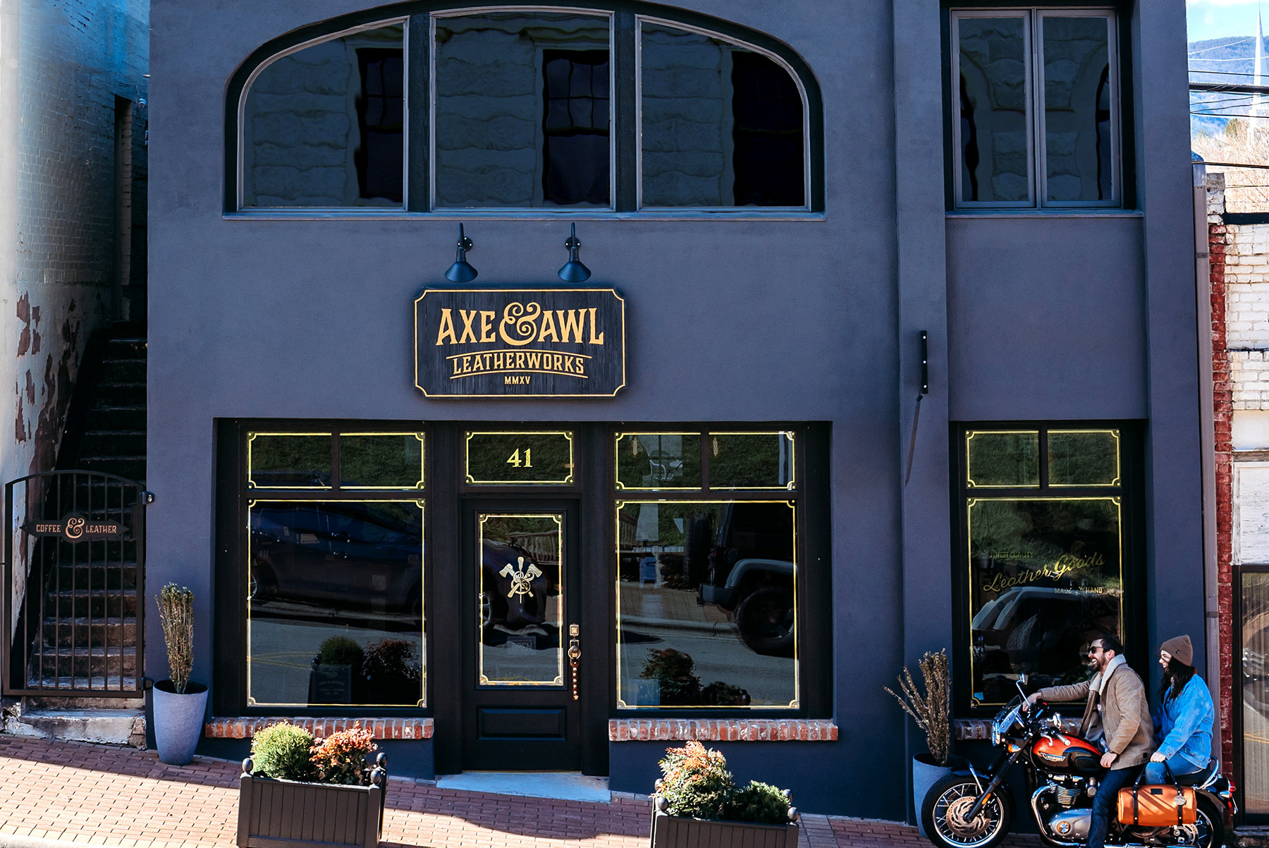
Axe & Awl Store Exterior Design
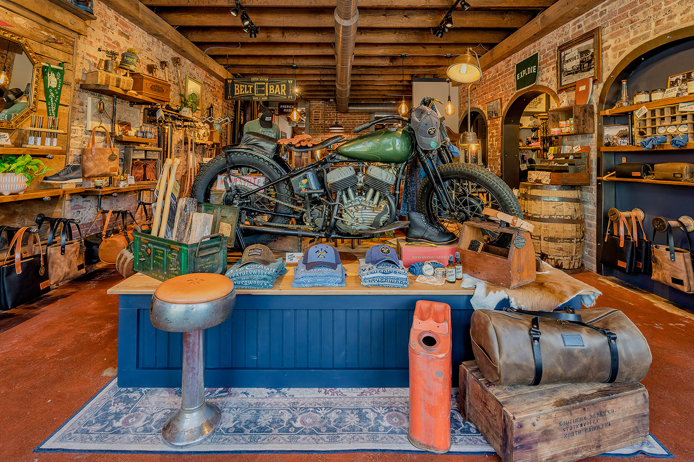
Axe & Awl Retail Environment Interior Design

Axe & Awl Leatherworks Branding
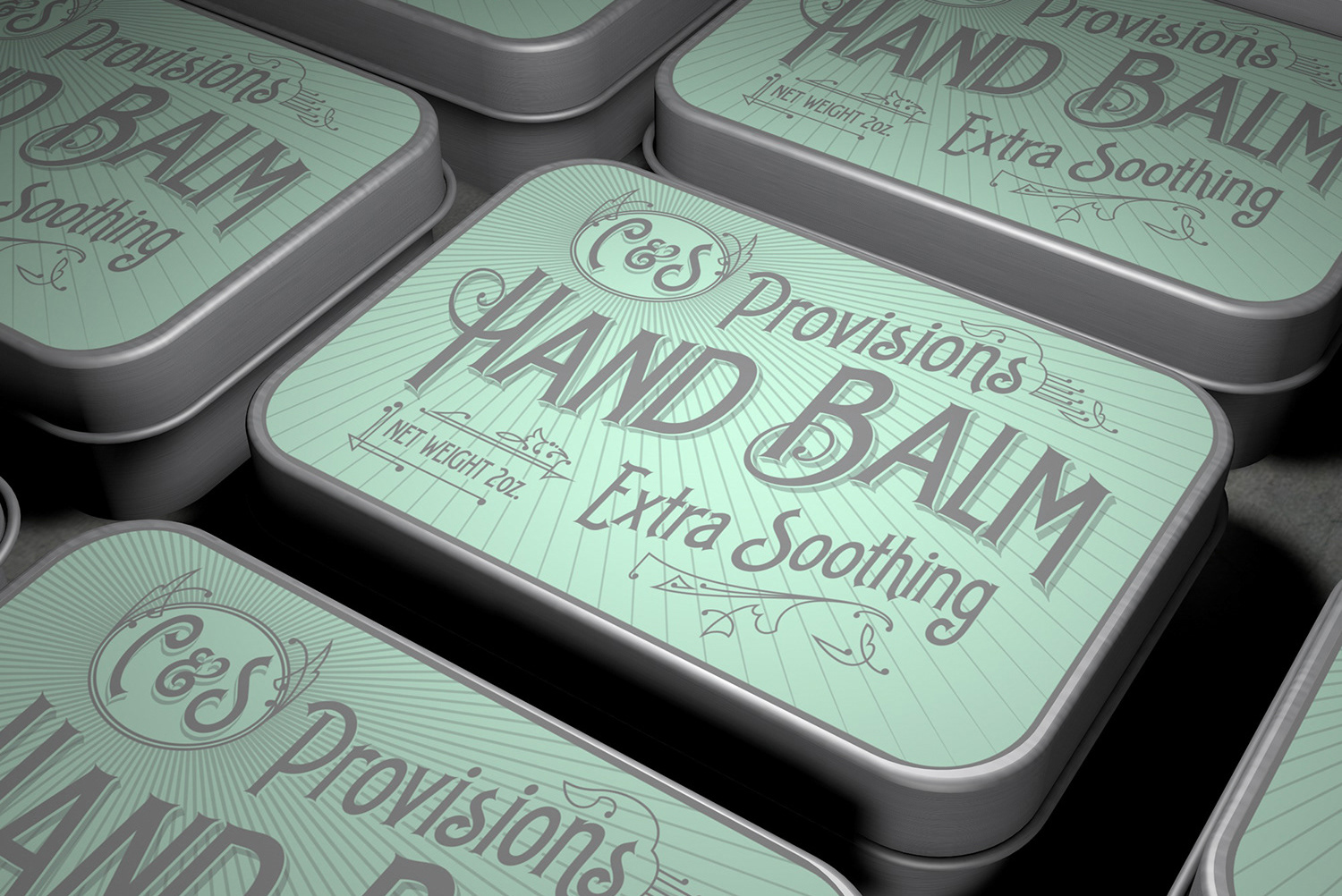
C&S Provisions
Peaches & Apricots Mural
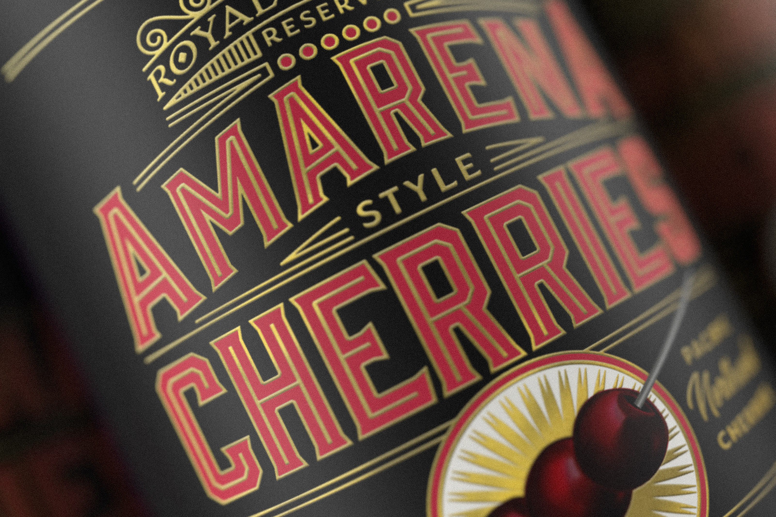
Royal Harvest Amerena Style Cherries
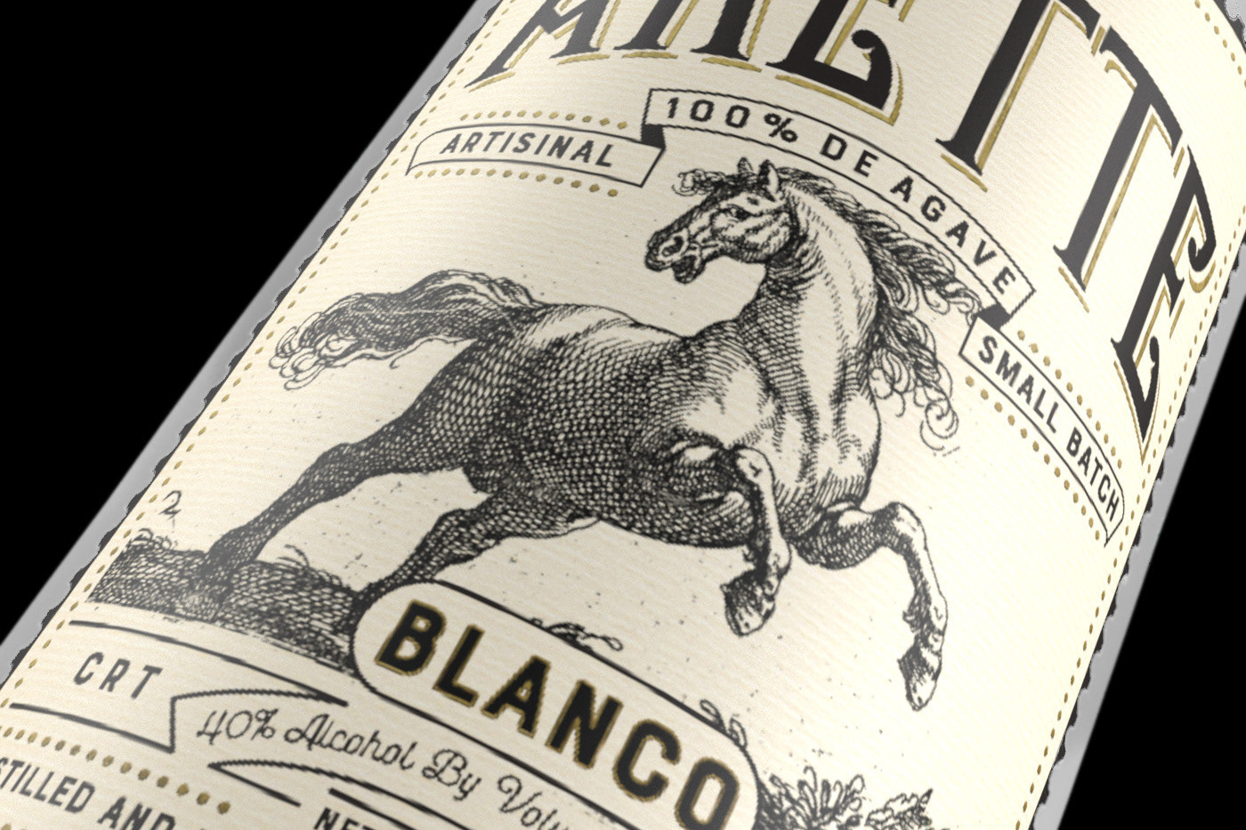
Tequila Arette Label
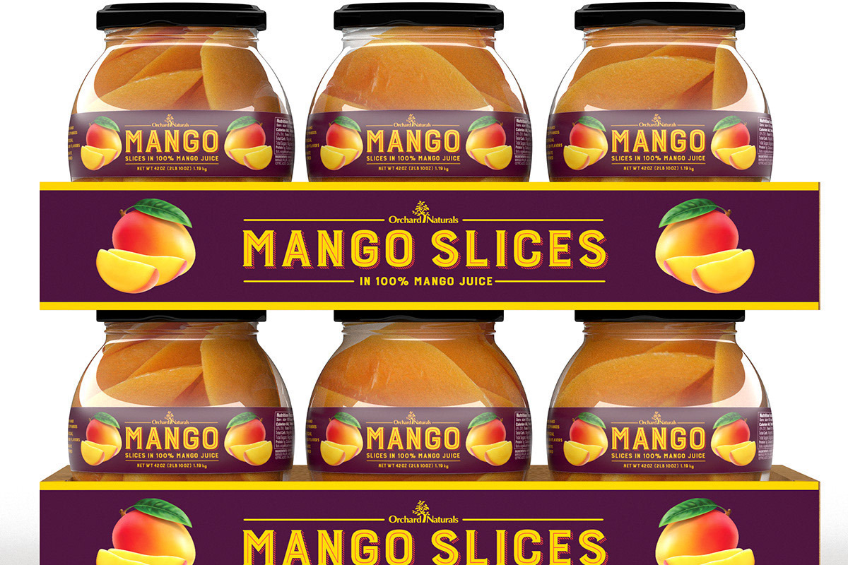
Orchard Naturals Fruit Packaging
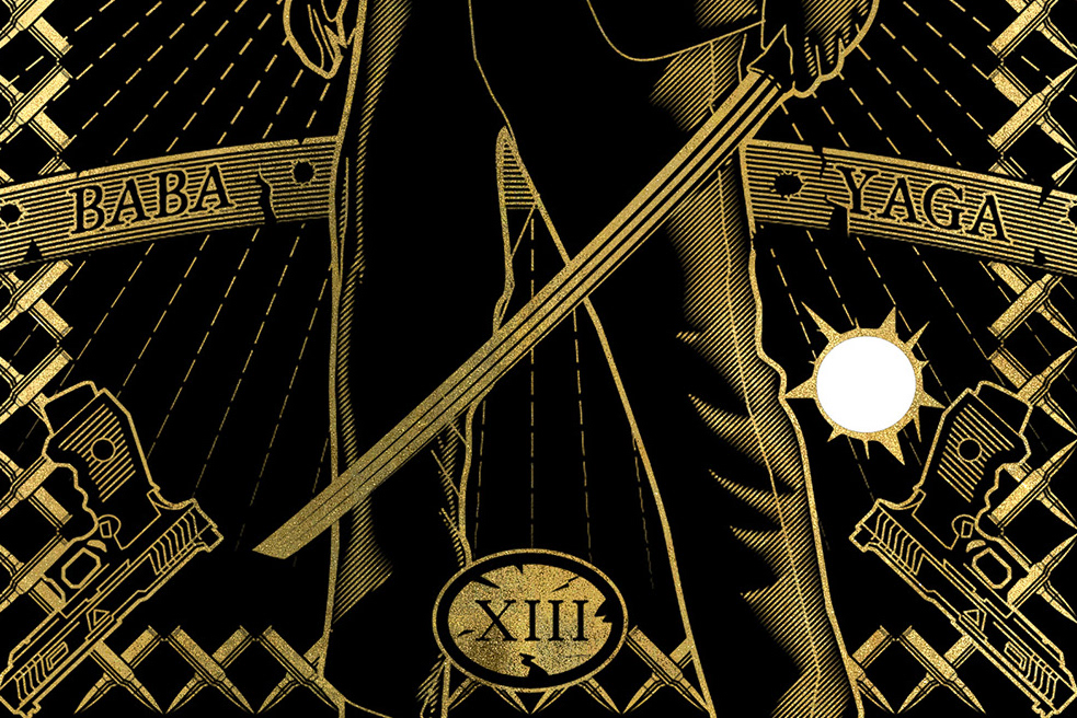
John Wick Tarot Card
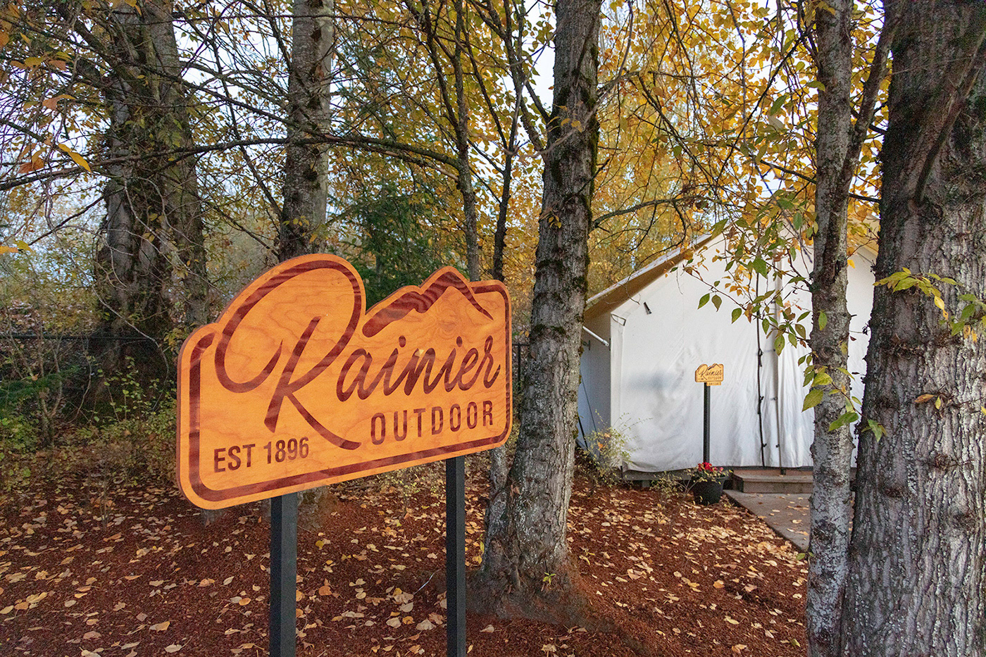
Rainier Outdoor Branding
Editorial Illustration & Design: Sactown Magazine
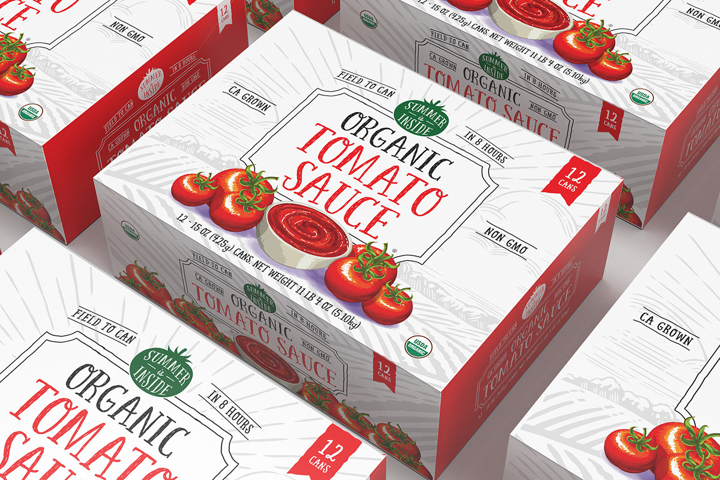
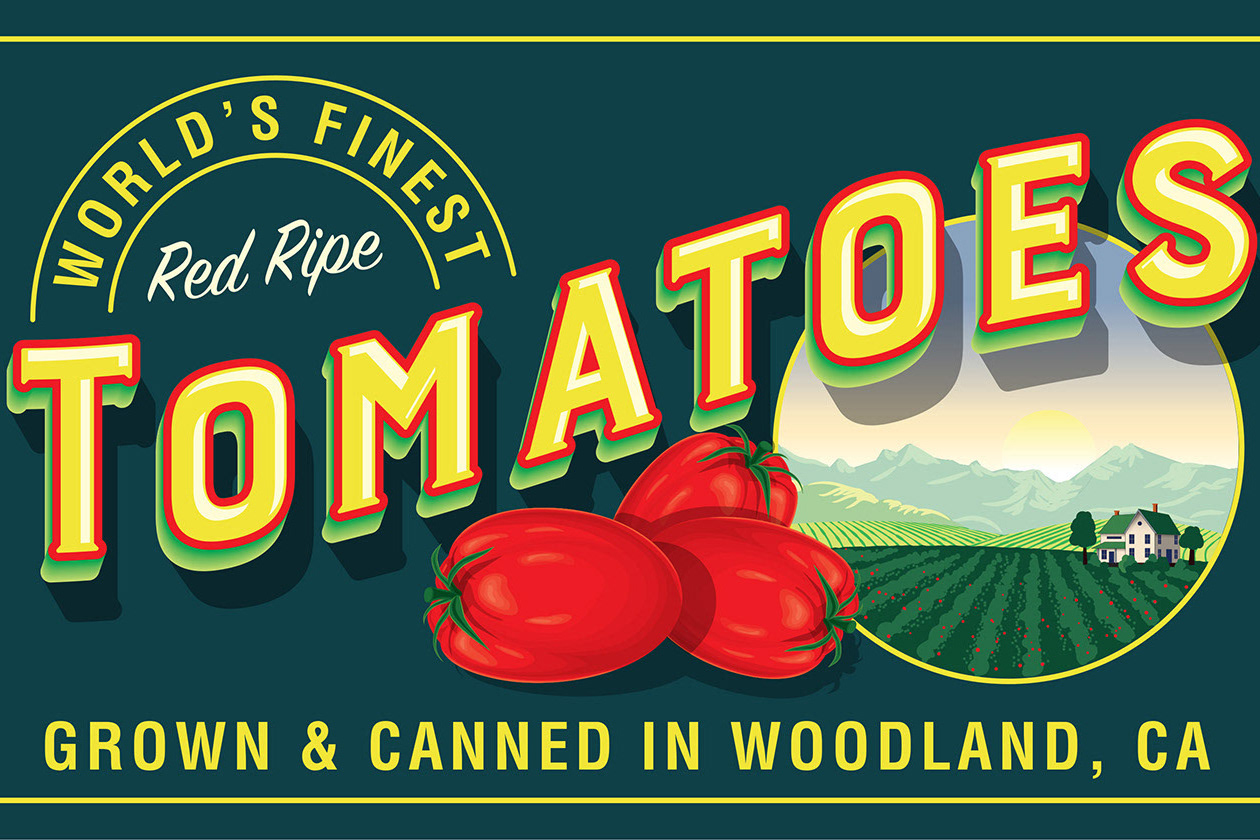
Summer Is Inside Brand Tomato
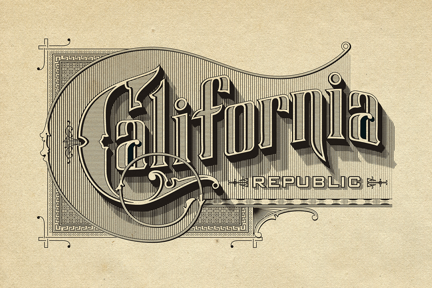
Vintage California Typography
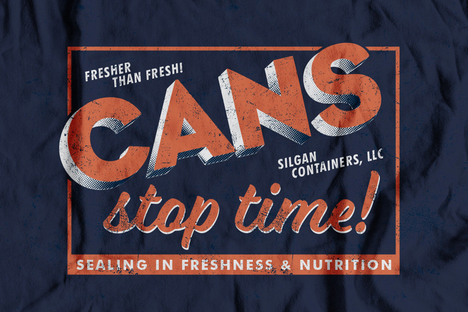
Cans Stop Time
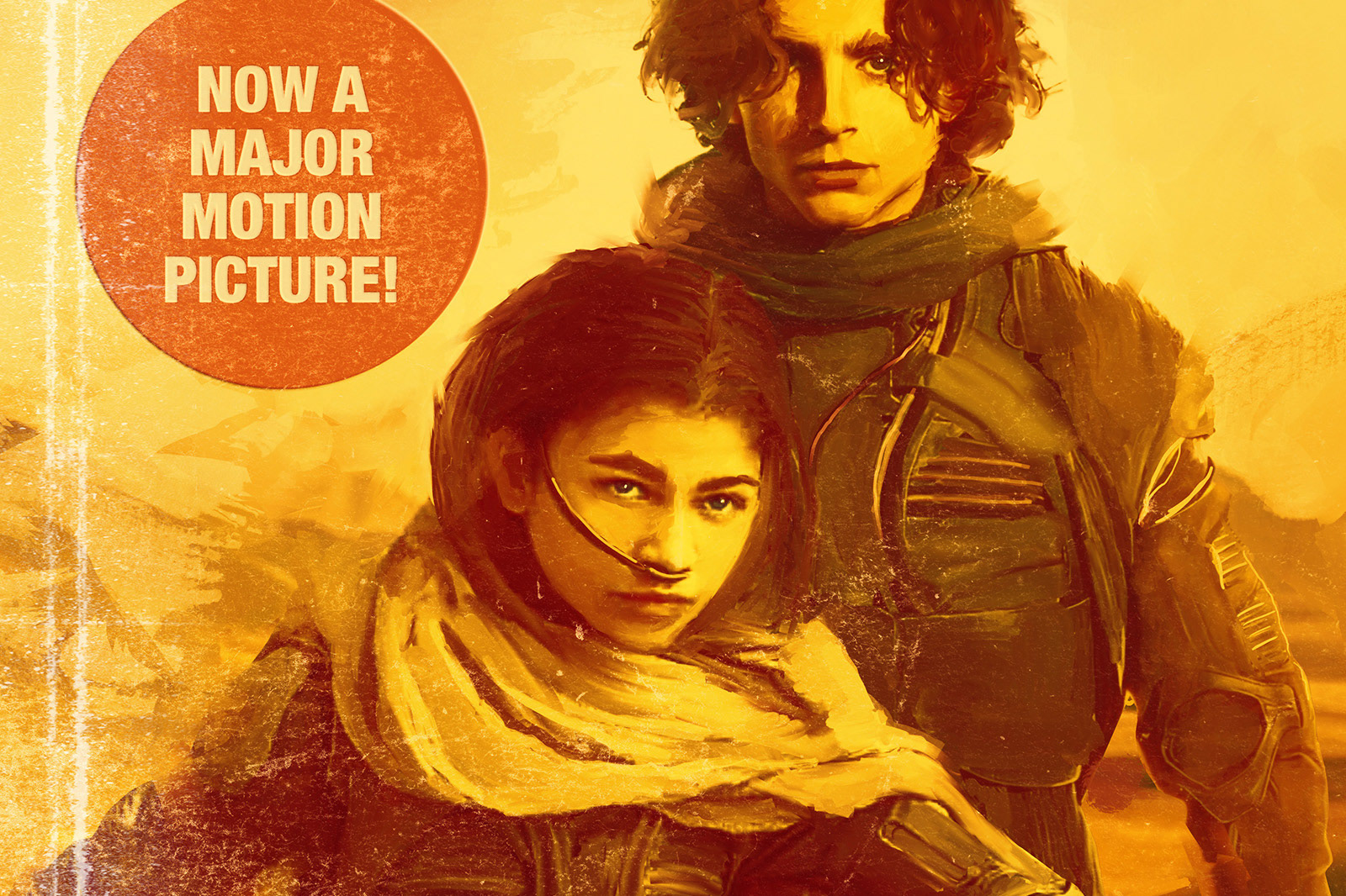
Fake Dune Book Jackets
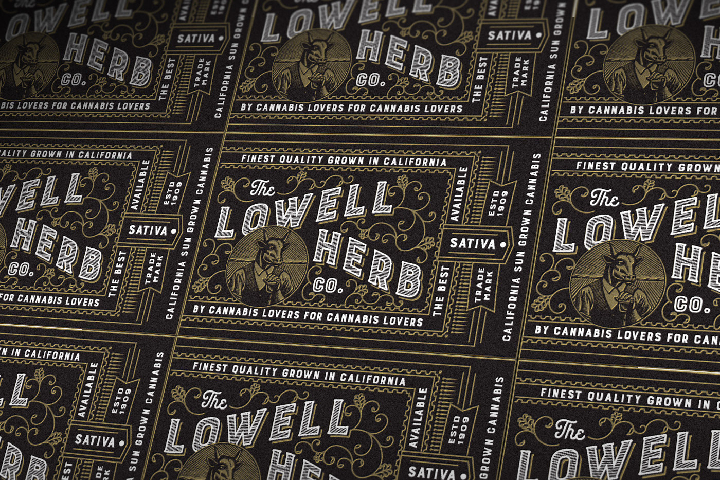
Lowell Letterpress Labels
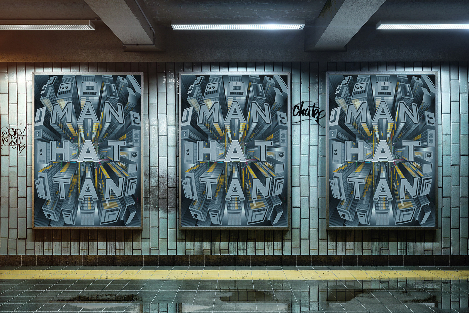
When You Think Of Home: Manhattan Poster
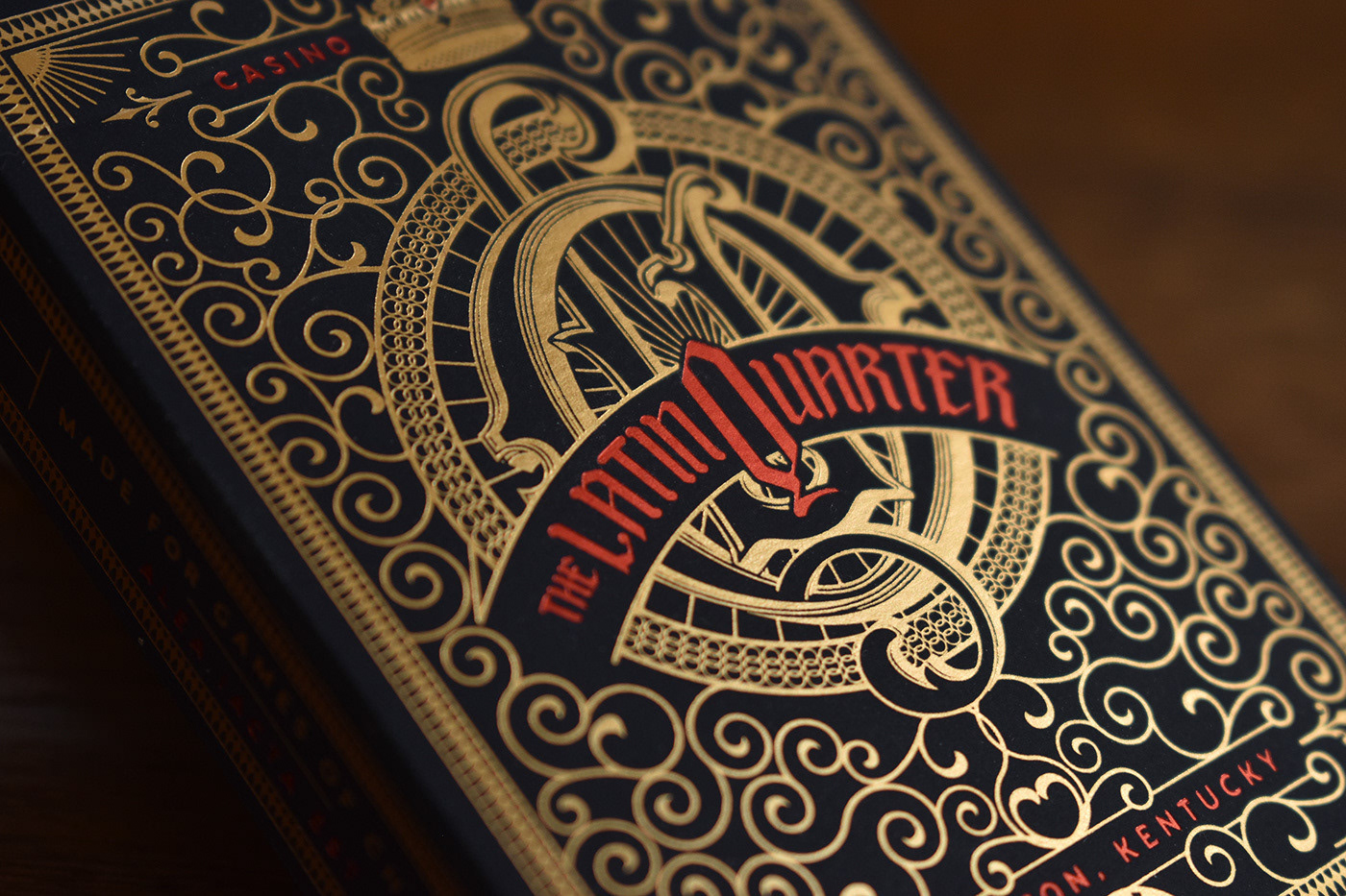
The Latin Quarter
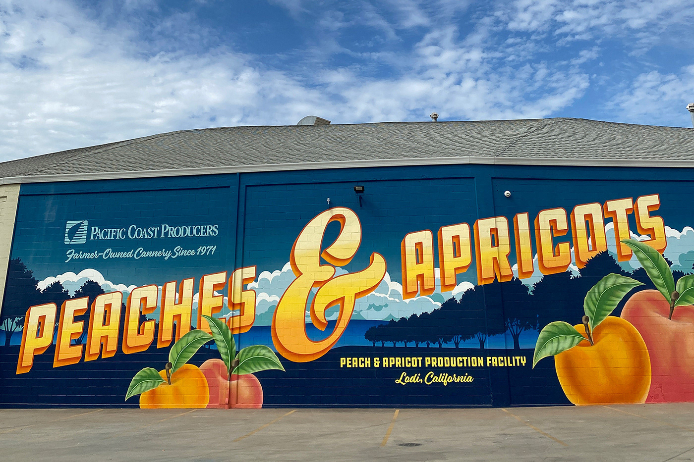
Pacific Coast Poducers Mural
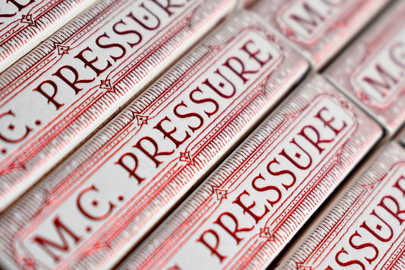
MC Pressure match box
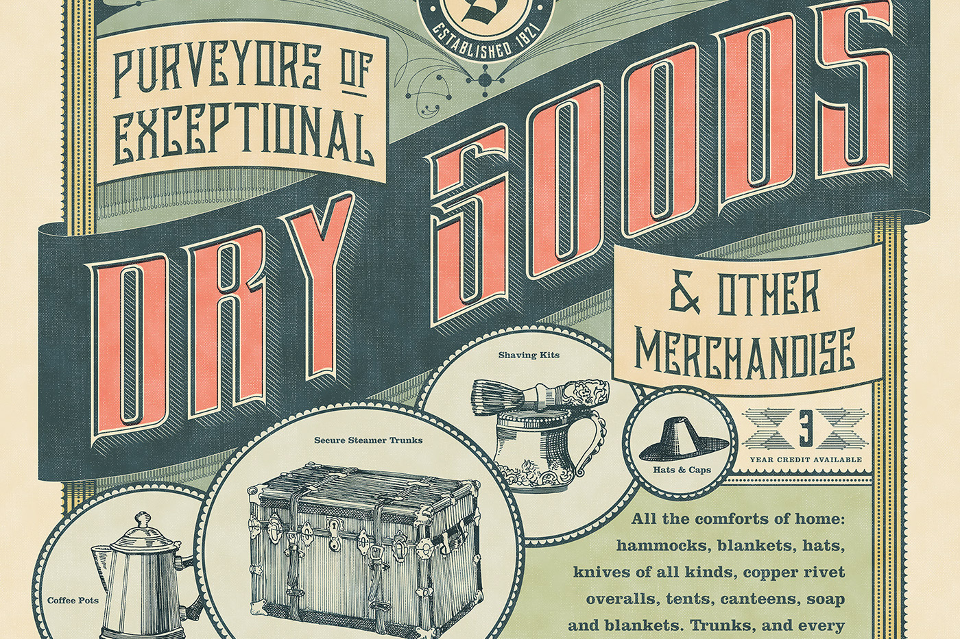
Dry Goods
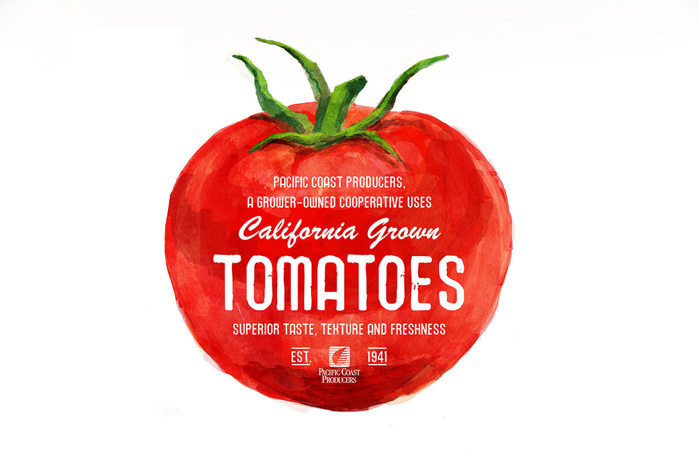
California Grown Tomatoes
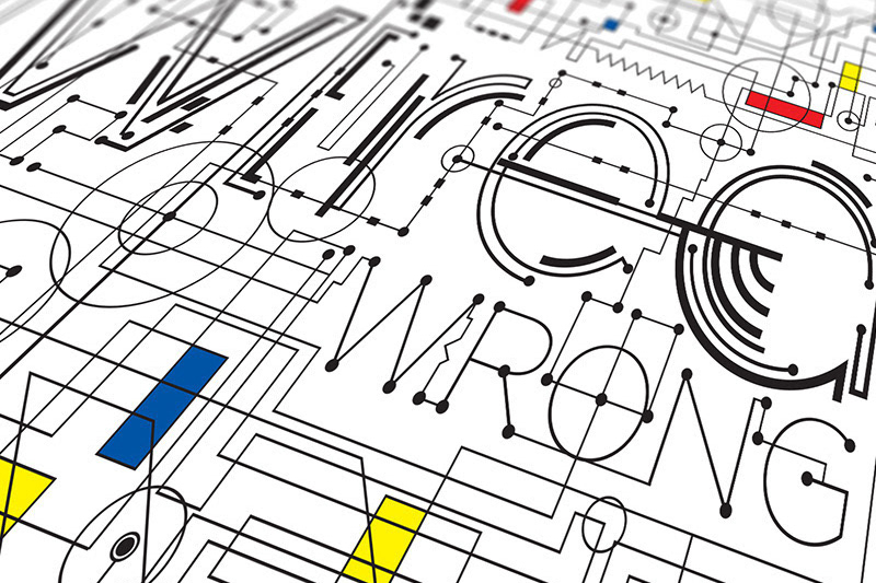
Wired Type
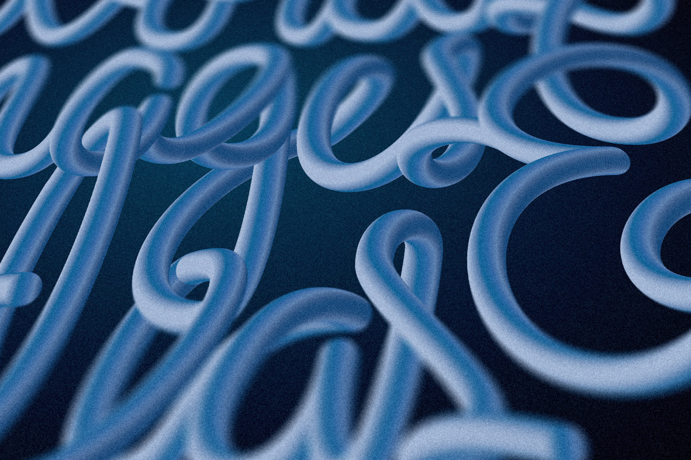
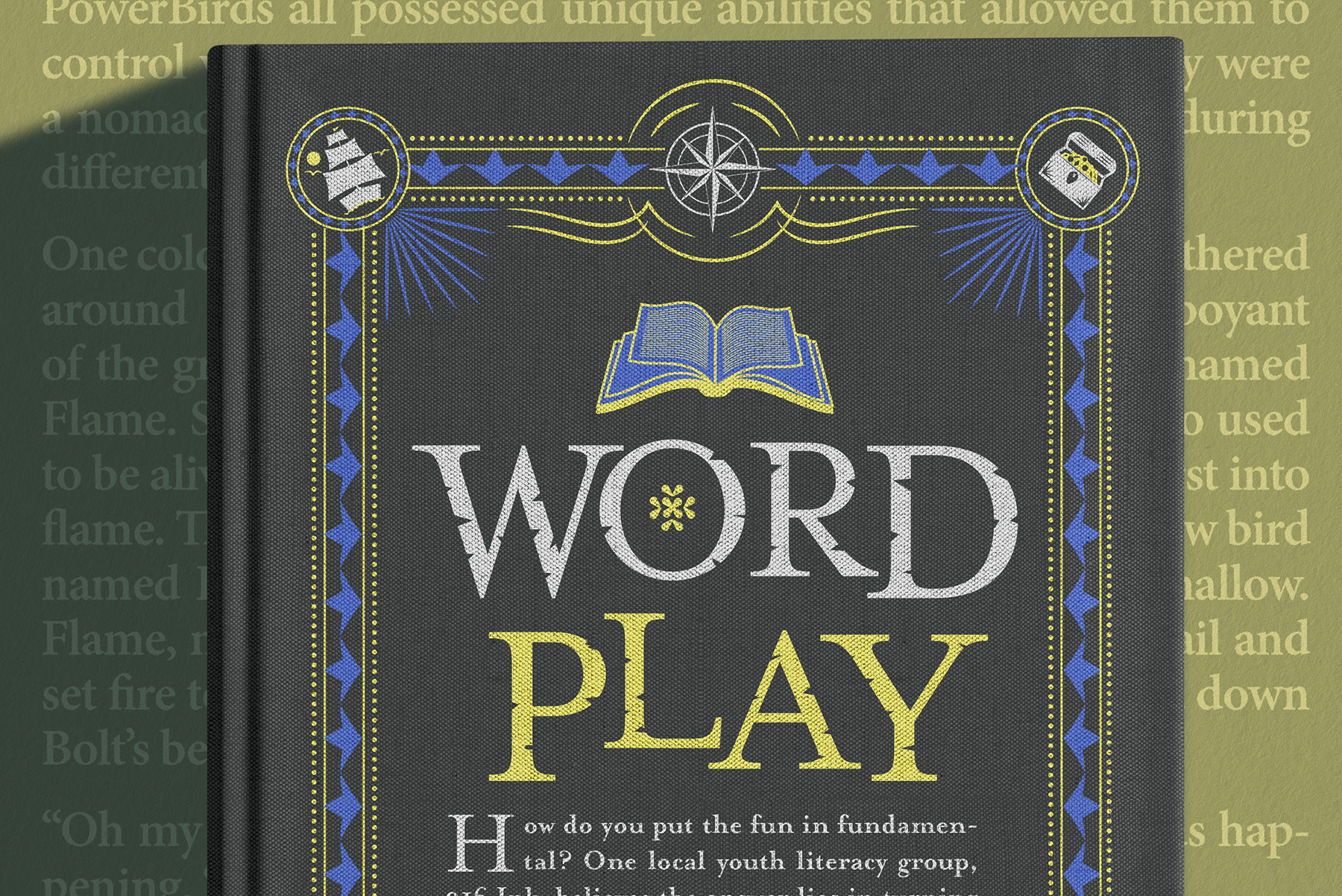
Words, Images & Ideas

10 Illustrated Numbers
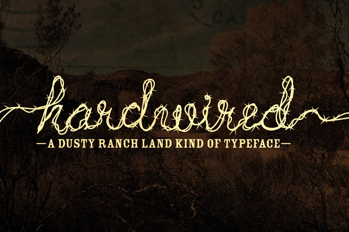
Hardwired Typeface

Pepsico Foodservice Campaign
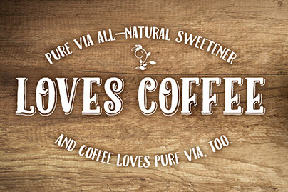
Pure Via All-Natural Sweetener Website & Mobile

Canada's Choice For Windows Logo
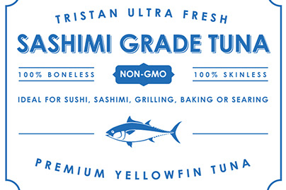
Tuna label
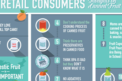
Canned Fruit Info Graphic
Concept Work For Cardinal International Glassware
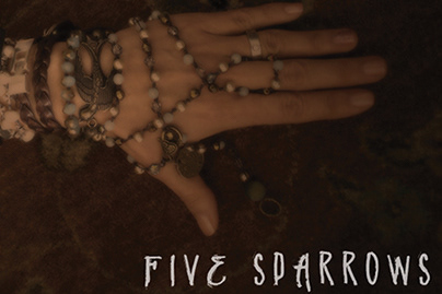
Five Sparrows Handmade Jewelry
Hollowware Manufacturer Logo

Milgard Infographic & Contractor Tips Book
Antiques Show Typography
Pacific Coast International Logo Design
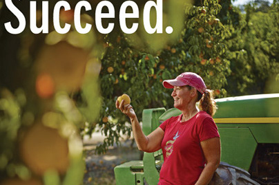
Pacfic Coast Producers
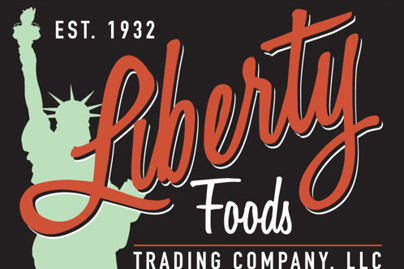
Liberty Foods Logo
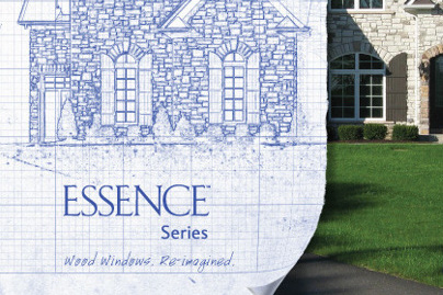
Essence Architectural Advertising Print & Web

Logos + Trademarks